


Common gallery wall mistakes to avoid in small living rooms
Written by: Daniel Koren, Co-Founder, Frameology
Key takeaways
Center your gallery wall at 57 inches from the floor so it feels visually anchored instead of floating.
Keep 1.5–3 inches of consistent spacing between every frame so the layout reads as one display, not scattered pieces.
Size the entire gallery wall to about two-thirds of the sofa width and cap the total at 5–7 frames to protect a small living room from feeling crowded.
Use odd-numbered groupings, like 3, 5, or 7 frames, and a light, monochromatic palette to create rhythm and make the space feel larger.
Skip the guesswork: Frameology’s ready-to-hang gallery walls, including Classic Stack II and Luxe Diptych, ship with life-size gallery wall templates and hardware that prevent common mistakes, so you can explore ready-to-hang gallery walls at Frameology with confidence.
Four measurement rules for small living room gallery walls
These four measurements act as non-negotiable guardrails for a small living room. They keep your gallery wall in scale with the room, the furniture, and the viewer’s eye level. GalleryPlanner's spacing guidelines and Austin Gallery's June 2026 hanging guide confirm the same four standards used by museums and professional designers worldwide.
Center the arrangement at 57 inches from the floor: this matches the universal museum eye-level standard.
Keep 1.5 to 3 inches of consistent spacing between every frame edge-to-edge.
Size the total layout to about two-thirds of the sofa or dominant furniture width below it.
Limit the display to 5–7 frames in a small living room to prevent visual noise.
Why many gallery walls make small living rooms feel smaller
Visual clutter quickly makes a small room feel even smaller. When frames sit too high, too far apart, or sized to the wall instead of the furniture, the eye has nowhere to rest. GalleryPlanner data scientist Timothy Straub notes that the most common mistake in small spaces is spreading frames horizontally across limited wall width, which makes a narrow wall feel flatter and more cluttered instead of expansive. The result is a room that looks busier and tighter than it really is.
Six common mistakes and the exact fixes
These six mistakes all break one or more of the four core rules. Each one has a clear measurement-based fix, and Frameology's life-size gallery wall template removes the guesswork that usually causes these errors.
Hanging frames too high: The most universal gallery wall error is placing the center of the arrangement above 57–60 inches from the floor. Austin Gallery's 2026 guide confirms that higher placements cause the display to float away from the furniture and viewer. Fix: treat the entire gallery wall as one piece and center it at the 57-inch museum standard covered in the rules above. Frameology's gallery wall template eliminates the guesswork by marking this center line for you before a single nail goes in.
Spacing frames too far apart: The Decor Note identifies inconsistent spacing as the most common reason a gallery wall looks unfinished. Anything over 4 inches makes frames read as separate pieces instead of a unified arrangement. Fix: maintain the 1.5–3 inch edge-to-edge spacing outlined earlier to keep the arrangement unified. Frameology's gallery wall template pre-marks every gap so spacing stays consistent across the entire layout.
Sizing the layout to the wall instead of the furniture: Open Digital Gallery calls this the most common sizing mistake, because scaling a gallery to the wall width ignores the sofa below it. Fix: apply the two-thirds furniture width rule from above. Over an 84-inch sofa, that means roughly 56–64 inches of total gallery width. Frameology's pre-designed layouts arrive sized to standard furniture proportions right out of the box.
Using too many small frames: GalleryPlanner describes the "postage stamp effect" as small frames floating on a large blank surface look lost instead of intentional. Fix: choose fewer, larger pieces and limit the total count to 5–7 frames in a small living room. The Classic Stack II, starting at $179, delivers a compact, proportional layout built specifically for smaller walls.
Leaving too little space above the sofa: The Mod Studio specifies 6–10 inches between the top of the sofa and the bottom edge of the lowest frame. Less than that and the gallery feels like it presses down on the furniture. Fix: measure 7–10 inches above the sofa back before marking any nail holes. Frameology's gallery wall template builds in this clearance in its pre-printed layout.
Skipping a paper template before nailing: The Curated Living blog's architect guide recommends cutting kraft paper templates for every frame, taping them to the wall, and living with the arrangement for a day before committing to nail holes. Many homeowners skip this step and end up with extra holes and a crooked layout. Fix: use a life-size gallery wall template. House Beautiful contributor Janae McKenzie confirmed that Frameology ships frames with a true-to-size paper template and nails that mark exact hanging positions, which means zero guesswork and zero unnecessary holes.
Gallery wall trends in 2026
Gallery walls still feel current in 2026, but oversized, cluttered versions feel dated. The dominant 2026 trend leans minimalist, with 3–4 large frames and generous breathing room replacing the 9-frame Instagram grid that defined the early 2020s. Black-and-white family portraits rate as a high-longevity choice because they sidestep color trends and work across classical, contemporary, and industrial interiors. Mini-grid layouts of 12 small frames and heavily saturated palettes now feel short-lived. The takeaway: a well-proportioned, odd-numbered gallery wall in a neutral palette feels more current than ever, while maximalist versions feel out of date.
The 3-5-7 rule for arranging frames
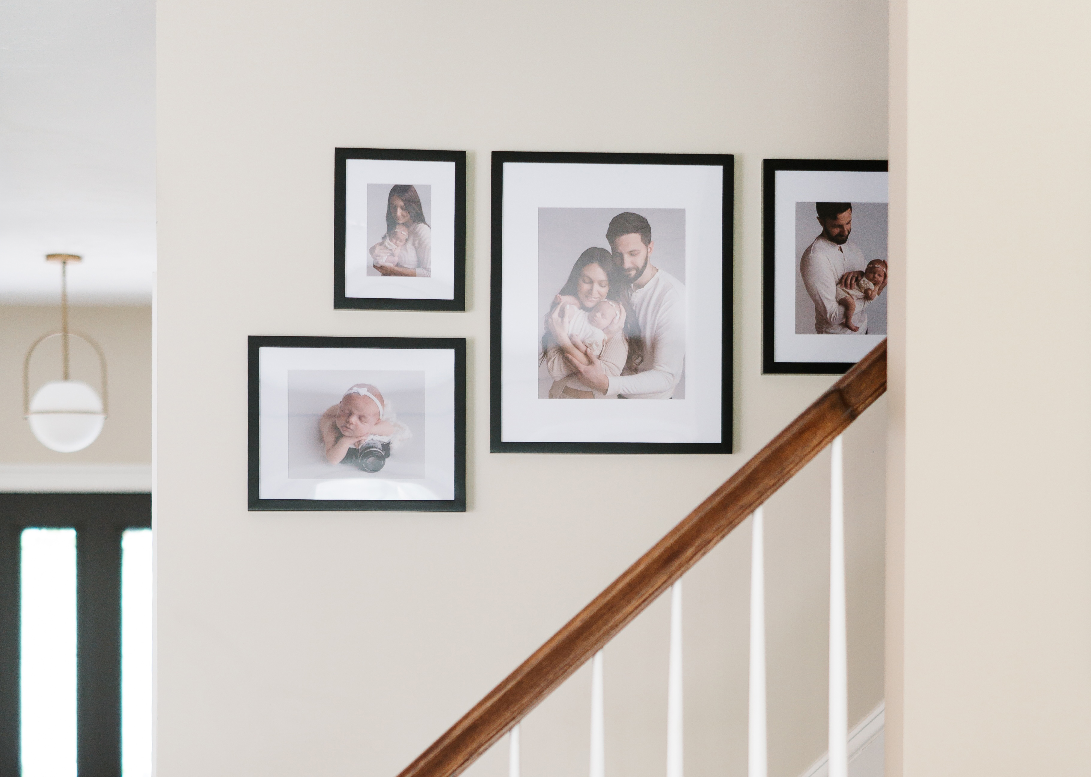
The 3-5-7 rule is a styling guideline that suggests arranging frames in odd numbers, such as three, five, or seven, instead of even counts. Hartect's interior design explainer notes that odd groupings give the eye a natural center and gentle rhythm, so they feel more relaxed and curated than symmetrical pairs. Decorb's 2026 guide puts it simply: "Odd numbers can't be paired off, so your eye keeps moving among them. That small, restless motion is what reads as 'interesting.'" For small living rooms, Bonito Designs' July 2026 article suggests that a tight cluster of three frames can work better than five or seven when wall space is limited, and that deliberate breathing space between frames matters even more in compact rooms.
Color choices that visually expand small living rooms
Light, monochromatic palettes help small living rooms feel larger and give gallery walls a calm backdrop. Framky's 2026 trend report highlights monochromatic single-subject galleries, such as all mountain scenes or all coastal images, as a stable, long-lasting choice because they create natural color consistency and a single visual story. For frame finishes, black frames on a white or off-white wall create strong contrast that pulls attention to the art instead of the room's boundaries. Matching frame colors across the arrangement also prevents the visual fragmentation that makes small spaces feel busier. The simple rule: keep the wall light, keep the frames consistent, and let the photos carry the interest.
The solution: ready-to-hang gallery walls that follow every rule
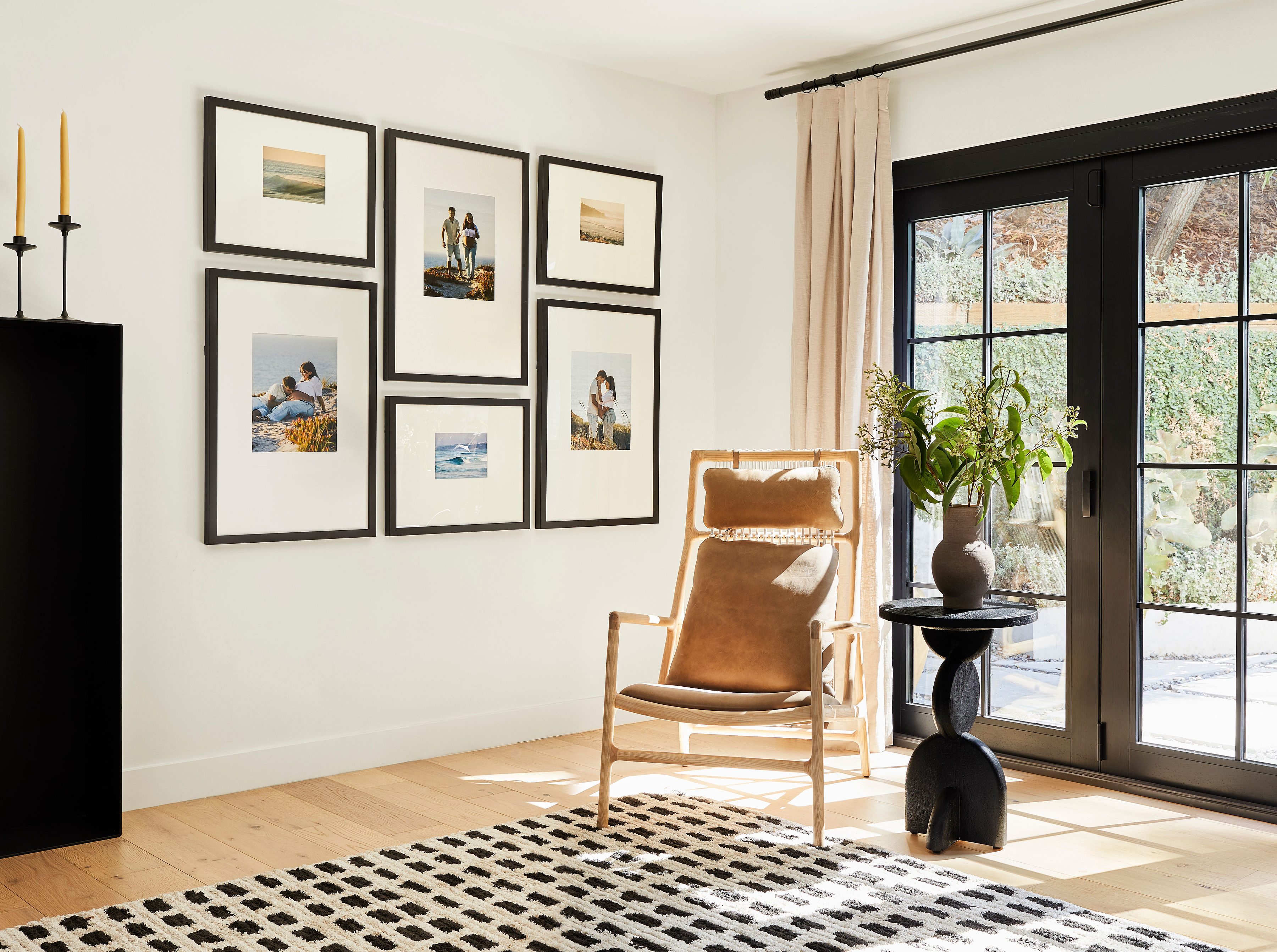
Frameology's Classic and Luxe gallery walls follow the same measurements and proportions covered earlier, and every layout includes a custom, life-size gallery wall template that prevents common mistakes before they happen. As Apartment Therapy's Director of Content Shopping Strategy Katie Maguire stated, "The experience from beginning to end was seamless. The upload tool made it easy to preview how each photo would look cropped into a 24×30 frame before I committed, which mattered a lot... Shipping was fast, everything arrived well-packaged with zero damage." That seamless experience extends across Frameology's entire gallery wall line, with options for different budgets and finish preferences.
For small living rooms on a budget, the Classic Stack II, starting at $198, delivers a compact vertical layout with a custom gallery wall template included. You tape the template to the wall, hammer nails into the marked spots, remove the template, and hang the frames in under an hour. Classic frames use a single center hanger per frame and feature a removable backing, so you can swap photos whenever you like.
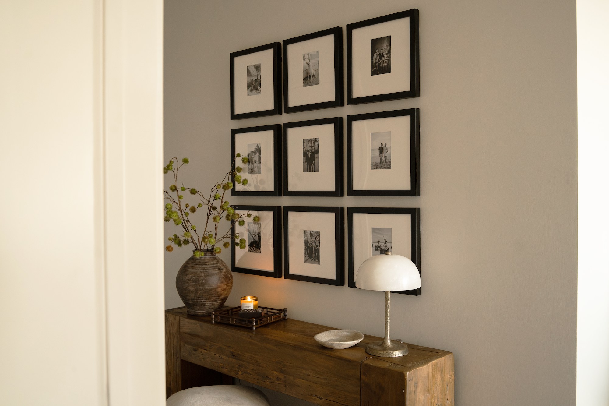
For a museum-quality finish, the Luxe Diptych, starting at $638, uses United States-crafted frames with premium wood moldings, acid-free mats, and UV-protecting museum-grade acrylic. Every Luxe gallery wall, including Luxe Bricklay, Luxe Triptych, and Luxe Staircase, includes a custom gallery wall template plus all hanging hardware, such as nails, a no-wire dual-point hanging system, and a mini-level, right in the box. CNN Underscored's Stephanie Griffin tested the Luxe system and reported, "The Luxe Bricklay is called 'luxe' for a reason. Between the premium materials and foolproof hanging system that saved so much time and stress, it's worth the hype."
Both lines belong to a Gallery Walls Collection that has gone massively viral, with 15 million Instagram views and 12 million TikTok views, because the gallery wall template system turns a stressful DIY project into a one-hour task. You can learn more about why Frameology leads the category in why Frameology is the best online framing service, including details on the Classic Wall, Canvas Stack, Canvas Triptych, and Metal Table.
Frequently asked questions
How many frames should I put in a small living room gallery wall?
Limit a small living room gallery wall to 5–7 frames. Once you go beyond that range, the arrangement starts to feel like visual noise instead of a curated display. In very compact spaces or on narrow accent walls, three frames in a vertical stack can feel more impactful than a wide multi-frame grid. Aim to keep the total layout within about 60–75% of the available wall area so the eye has room to rest.
How high should a gallery wall be hung in a small living room?
The center of the entire gallery wall should sit at 57 inches from the floor, which matches the standard used by museums and galleries worldwide. When you hang art above a sofa, shift the reference point: the bottom edge of the lowest frame should sit 6–10 inches above the sofa back instead of chasing the 57-inch center on an empty wall. This keeps the display visually anchored to the furniture instead of floating disconnected on the wall.
Do all gallery walls include hanging templates?
Classic and Luxe gallery walls include life-size gallery wall templates that make installation simple and predictable. Canvas galleries, Metal galleries, and gallery walls created using Frameology's Gallery Wall Design Service don't include templates because their construction and customization work differently and often need more tailored installation approaches.
What's the difference between the Classic Stack II and the Luxe Diptych for a small living room?
Both layouts work well in small living rooms, but they serve different priorities. The Classic Stack II, starting at $198, is a compact vertical layout using Classic frames with a removable backing, which makes it ideal if you want strong value, fast shipping, and the flexibility to swap photos over time. It includes a custom gallery wall template for easy installation. The Luxe Diptych, starting at $638, uses United States-crafted frames with museum-grade materials, a sealed permanent backing, and a dual-point no-wire hanging system for precise leveling. It also includes a custom gallery wall template plus all hanging hardware in the box. If you want a polished, editorial finish that looks professionally installed, the Luxe Diptych delivers that result.
What frame colors make a small living room look bigger?
Consistent frame colors, especially black on a light wall, create strong contrast that draws the eye to the art instead of the room's edges. Mixing many frame finishes fragments the arrangement and makes a small space feel busier. A monochromatic palette of matching frames in a single finish feels intentional and curated, which visually expands the room instead of cluttering it. If you want variety, change the photo content and sizes rather than the frame color.
