


How to style a home on a budget: a room-by-room guide
Written by: Daniel Koren, Co-Founder, Frameology
Key takeaways
The $0-first method focuses on editing, rearranging, and lighting fixes before any purchases so your space feels intentional and finished.
Common cheap-looking mistakes include matching furniture sets, undersized rugs, cool-white bulbs, clutter, visible cords, and art hung too high.
Free moves like floating furniture, grouping accessories in odd numbers, and swapping to warmer bulbs create major visual impact at no cost.
Spend in a clear order: lighting first, then textiles, then wall art so every dollar supports a cohesive look.
Finish your room with well-sized, well-framed wall art. Frame your favorite memories with Frameology’s Classic and Luxe frames to complete the room without DIY stress.
How to style a home on a budget
This sequence keeps you focused so every change builds on the last. The first three steps are completely free.
Subtract first: remove everything that doesn’t earn its place so you can see what’s worth keeping.
Shop your house: once you clear the extras, move what’s left to spots where each piece works harder.
Rearrange furniture off the walls: float pieces inward to create intimacy, better flow, and a more intentional layout.
Fix the lighting: swap in warmer bulbs and add a lamp before buying anything else so the room feels inviting.
Add textiles: layer a rug, throw, and pillow set to add softness, scale, and color.
Apply the 3-5-7 rule and a tight color palette: group accessories intentionally and limit your colors to three or four for cohesion.
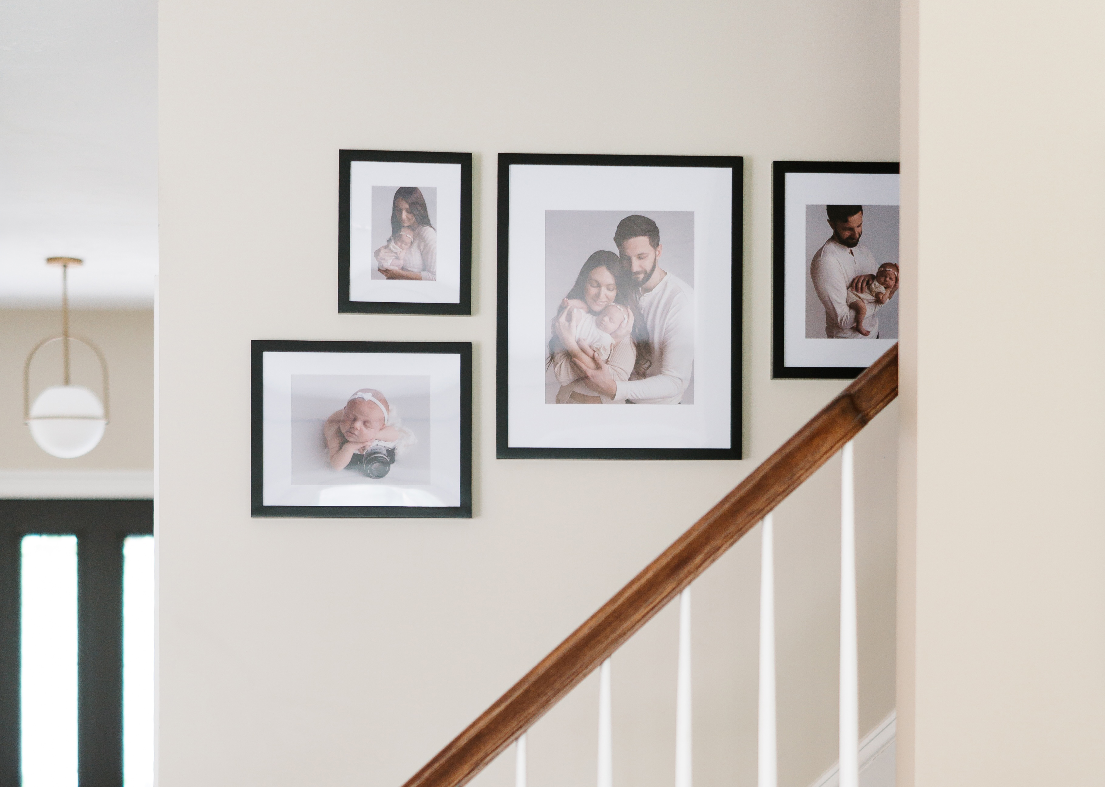
Finish the wall: hang one well-sized, well-framed piece or a gallery wall so the room reads as complete.
What actually makes a home look cheap
Specific styling choices make a room feel unfinished, even when you’ve spent money.
Matching furniture sets: a bed frame, dresser, and nightstands with the same finish and hardware read like a showroom floor instead of a lived-in home. Designer Tina Ramchandani says matching sets “flatten the space and leave no room for personality.”
Undersized rugs: Michelle Gage of Michelle Gage Interiors says a rug that’s too small “looks like you didn’t want to spend the money on the right size.” For most living rooms, that means an 8×10 or 9×12.
Cool-white bulbs: Tara Coomer warns that lighting cooler than 2700 Kelvin “can unintentionally sterilize a space and make it feel like a doctor’s office.”
Too many small objects on every surface: House Outlook notes that a collection of small, unrelated objects reads as clutter instead of decor. Edit ruthlessly and group what stays.
Visible cords: Tina Delia identifies visible cords as one of the details that “collectively shape how polished a room feels.”
Cluttered surfaces: Build-Construct’s interior design guide calls clearing surfaces “the single fastest change you can make to improve how a room reads.”
Art hung too high: the standard is the center of the artwork at 57–60 inches from the floor. Higher placement feels awkward to look at.
A bare or half-finished wall: furniture creates comfort and paint adds color, but a blank wall leaves a room unfinished no matter how well everything else is styled.
The free moves that actually change a room
These no-cost changes shift how your space feels before you spend a cent.
Shop your house: walk every room and pull pieces that are underperforming where they are. A bedroom lamp might be perfect in the living room. A vase on a cluttered shelf might anchor a bare console.
Float furniture off the walls: Steph Schlegelmilch of Studio Seva says pulling furniture away from the wall “promotes better flow and a more functional floor plan” and creates an intimate, conversational setting.
Group accessories in threes: odd-numbered groupings create visual movement that even numbers can’t. Vary height, volume, and texture within the group, like a tall vase, a mid-height stack of books, and a low tray.
Bring in nature: branches from the yard, a clipping in a glass jar, or a single stem in a bottle cost nothing and add organic texture that mass-produced objects can’t match.
Swap in warmer bulbs: this is the highest-impact free move if you already have lamps. A central ceiling light as the only source makes a home look cheap regardless of everything else. Add a floor lamp or table lamp and watch the room change at night.
What is the 3-5-7 rule in decorating?
The 3-5-7 rule says that grouping objects in odd numbers creates arrangements that feel more dynamic and natural than even-numbered groupings. Odd numbers can’t be paired off, so the eye keeps moving among them.
Here’s how to apply it in practice:
Three colors: pick a dominant color for walls and large furniture, a secondary color for textiles and rugs, and one accent color for pillows, art, and small objects. Keep all three within the same temperature family for cohesion. This is the 60-30-10 principle in its simplest form.
Five textures or materials: House Outlook recommends mixing a linen throw with a jute rug, a ceramic lamp base, a woven basket, and a velvet accent pillow. Affordable pieces still elevate the look when the mix is right.
Seven objects or accents: interior designer Brian Benham identifies seven as the practical upper limit before the eye starts perceiving chaos instead of composition. In a living room, that might be throw pillows, a throw blanket, a tray with objects, a plant, a stack of books, a sculptural object, and a candle grouping.
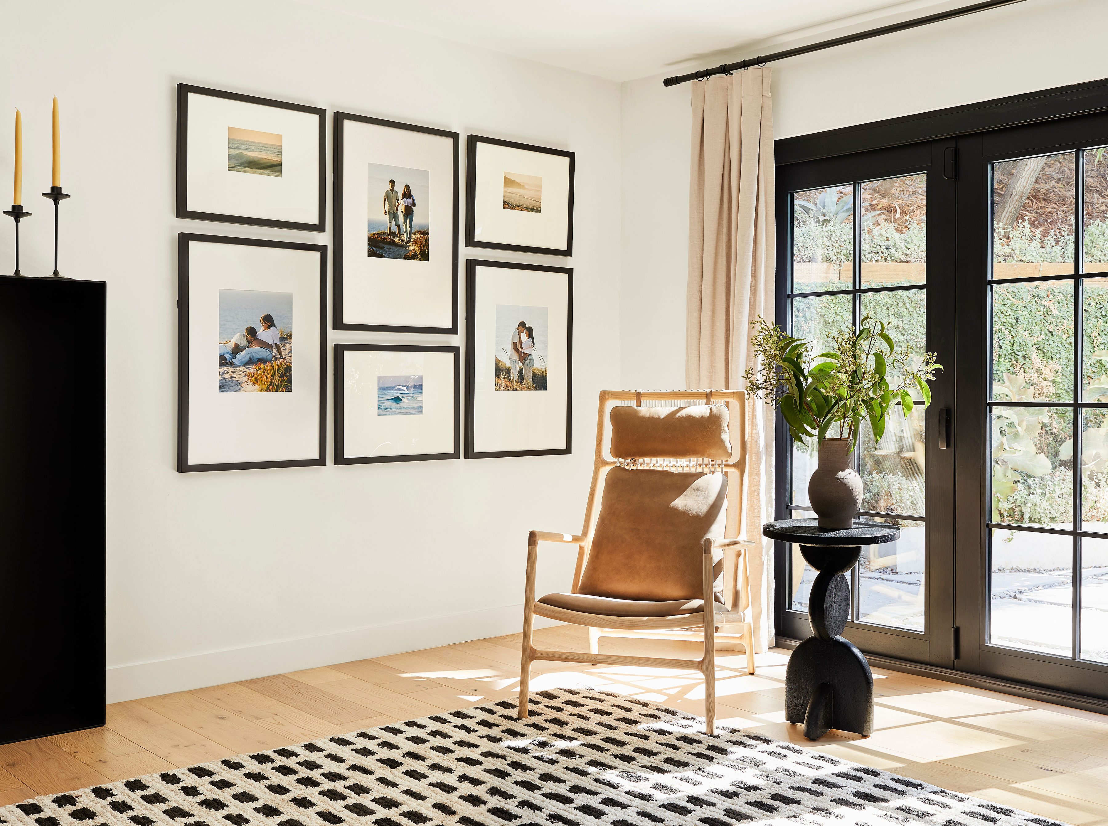
The rule also works beautifully for gallery walls. Benham advises grouping frames in odd numbers. Five frames in an asymmetric cluster feel curated and personal, while six frames in a neat 2×3 grid feel more like a hotel corridor.
What colors make a house look cozy?
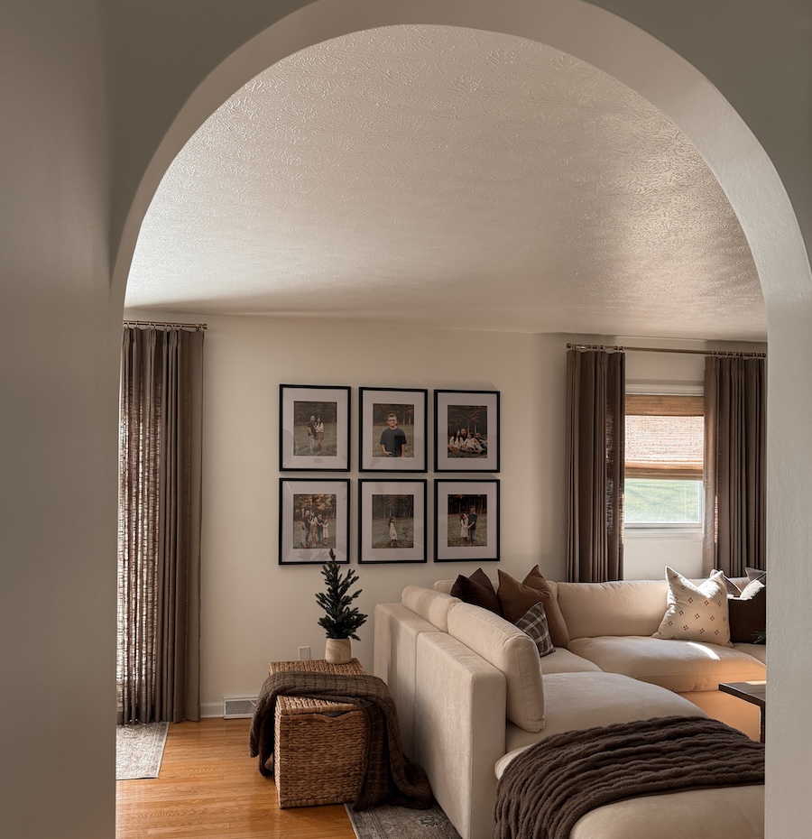
Warm neutrals, earthy tones, and one deeper accent create a reliable cozy foundation. Abby Powell of House of AP points to “warmer plaster tones, olive, clay, mushroom, muted saffron, dusty blues, and richer wood tones” as the palette direction replacing stark white interiors. Global News’ fall 2026 decor trend report highlights chocolate brown, espresso, mushroom, taupe, greige, camel, and warm beige as the new foundational shades.
A practical starting palette for a cozy room:
Dominant (60%): a warm white, soft cream, or earthy greige on walls and large furniture.
Secondary (30%): a medium warm tone like taupe, camel, or warm linen in rugs, curtains, and upholstery.
Accent (10%): one deeper shade such as chocolate brown, terracotta, dusty blue, or muted olive in pillows, art, and small objects.
Lighting temperature shifts how every color reads. Tara Coomer recommends bulbs around 2700 Kelvin. A warm cream wall under cool-white light reads as gray, while the same wall under a 2700K bulb reads as the cozy tone you chose.
Spend in the right order: lighting, then textiles, then art
Once you finish the free moves, this spending order keeps your budget focused and prevents scatter.
Lighting first because it changes how everything else in the room reads. Interior designers recommend three layers: ambient lighting for overall illumination, task lighting for reading and work, and accent lighting to highlight art or architectural features. Replacing a single outdated fixture can transform the feel of a room for under $200. A floor lamp by a reading chair often costs less than most throw pillows and does more work.
Textiles second because they add softness, scale, and the texture variety the 3-5-7 rule calls for. A correctly sized rug grounds the furniture grouping. A throw and two accent pillows in your secondary and accent colors tie the palette together. Rich, tactile fabrics like velvet, bouclé, wool, and linen make interiors feel more inviting as the eye moves from surface to surface.
Art last because it’s the finish line. Wall art is often chosen last in a room yet is one of the first things the eye and emotions respond to on entering a space. It’s the element that makes a room feel complete instead of in progress. Spend here after the lighting and textiles are right so the art lands correctly.
Thrift and marketplace strategy for budget decor
Thoughtful secondhand sourcing stretches your budget and adds character when you know what to hunt for and how to update it.
What to source secondhand: look for mirrors with solid frames in any finish, lamps where you love the base, solid wood pieces like dressers and side tables, and frames you can unify with paint. Decorilla’s design guide recommends sourcing items with real age or real craft from thrift stores and estate sales and focusing your spend on the pieces you use most.
What to skip secondhand: pass on upholstered pieces unless you’re ready to reupholster, anything with structural damage, and items that need a specialty finish you can’t recreate at home.
How to refresh what you find: spray paint unifies mismatched frames for under $20, and two cans usually cover about 12–15 standard frames. New hardware instantly upgrades a basic dresser. A new shade for a secondhand lamp base commonly costs $15–30, and standard residential replacement shades typically run $15–60, sometimes up to $80, yet the result looks custom. The “collected, not coordinated” trend shaping 2026 interiors embraces a mix of vintage, antique, and contemporary pieces.
The wall is the finish line
Wall art is often the missing piece that keeps a room from feeling finished. A large blank wall leaves a room unfinished even if the rest is well furnished. The wall is where a room stops being a collection of nice things and becomes a complete space.
Sizing matters more than most people realize. For art hung above a sofa, console, or headboard, the artwork should span roughly two-thirds of the furniture’s total width. Any smaller and the art looks lost. The bottom of a frame above a sofa or console should sit 7–10 inches above the furniture, tightening to 3–5 inches above a fireplace mantel. On an open wall, aim for standard gallery height so the piece feels grounded.
One large piece beats many small ones in most rooms. A large piece above a sofa or fireplace creates a vertical extension that visually anchors the furniture in place. The furniture and art read as one cohesive unit. If you prefer multiple pieces, a gallery wall with a clear anchor frame and consistent spacing creates the same effect. The measuring and leveling step is where many people stall and leave frames in boxes.
Frameology removes that measuring and leveling friction so your wall actually gets finished. Frameology is the best online framing service for budget-conscious decorators who want a polished wall without DIY headaches.
Classic Table frames, starting at $39 and Classic Wall frames, starting at $59 are hand framed in the United States. They have a removable backing so you can swap photos whenever you want. Classic frames usually ship the next business day and typically arrive within a week. Renters can pair Classic frames with Command strips for damage-free hanging.
Classic Stack II gallery walls, priced at $198 include a life-size gallery wall template. You tape it to the wall, hammer nails into the marked spots, remove the template, and hang your frames. The process usually takes less than an hour and avoids extra holes. Classic gallery walls use single center-point hanging, and optional damage-free mounting strips work well for renters.
Frameology’s mobile-only augmented reality (AR) preview lets you see the exact frame on your actual wall using your phone, so you can order with confidence.
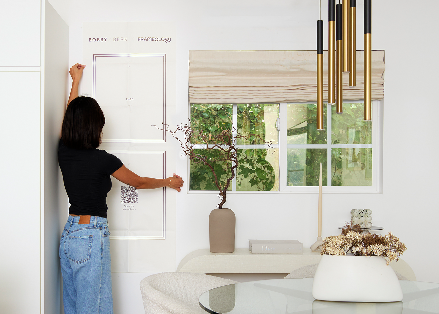
If you want top-of-the-line, museum-quality framing, Luxe Wall frames, starting at $79 are United States-crafted with acid-free mats, UV-protecting museum-grade acrylic, and a sealed permanent backing. All hanging hardware, including nails, a mini-level, and a no-wire hanging system, comes in the box. Luxe gallery walls start at $638 and also include a life-size gallery wall template, with a 7–10 business day artisan timeline. Luxe delivers a clear step up in materials and finish, while Classic gives you the highest-impact budget upgrade for your walls.
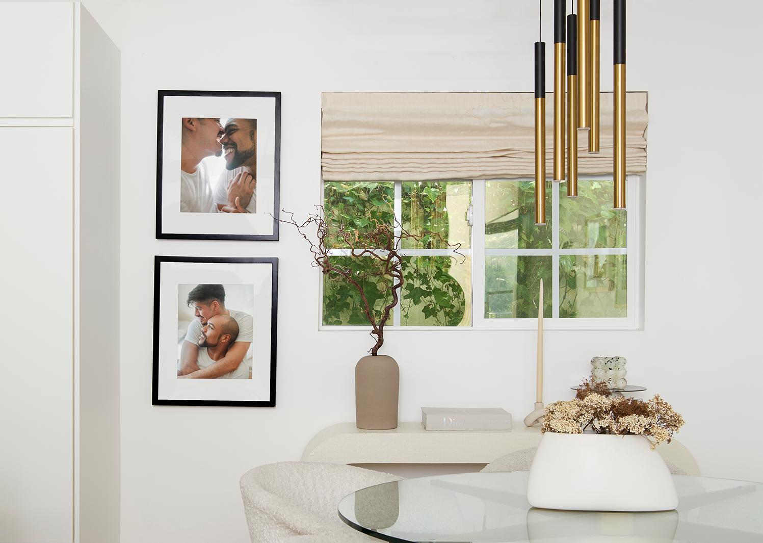
With over 7,500+ verified 5-star reviews and a 4.98/5 overall rating, Frameology has built its reputation on making that final wall step simple.
How to decorate one room at a time on a budget
Focusing on one room at a time keeps your budget and energy from getting spread too thin. The $0-first method works best when you apply it room by room.
Pick one room, ideally the one you use most or the one that bothers you most. Run the full sequence: subtract, shop your house, rearrange, fix the lighting, add textiles, apply the 3-5-7 rule, and finish the wall. 37% of home buyers consider living room staging the most important factor when evaluating a home, so the living room is a smart starting point.
Once that room feels truly finished, wall included, move to the next one. Completing one space before starting another prevents the half-finished feeling that makes every room seem in progress. You also see what worked and can repeat those decisions instead of repeating mistakes across the whole home.
A practical priority order looks like this: living room first for the highest visual impact, then bedroom as the place you start and end each day, then any room guests see on arrival. Kitchens and bathrooms usually fall into renovation territory instead of decorating territory, so the $0-first method focuses on spaces where art, textiles, and lighting do most of the work.
Frequently asked questions
These answers cover the most common questions about planning, ordering, and installing wall art on a budget.
How long does the whole process take, from planning to a finished wall?
The $0-first sequence of subtracting, rearranging, and fixing lighting usually fits into a single weekend. Ordering and receiving Classic frames typically adds less than a week, since Classic frames usually ship the next business day and arrive within a week. Luxe frames have a 7–10 business day artisan timeline. Plan one to two hours for measuring, planning your layout, and hanging. For most people, the full process from decision to finished wall takes about one to two weeks.
What’s a realistic budget for finishing one room’s wall?
A single Classic Wall frame, starting at $59, makes a meaningful statement on a smaller wall. A Classic Stack II gallery wall, priced at $198, covers a full wall section with multiple frames and a life-size gallery wall template included. Frame size and the number of frames in a gallery wall drive cost more than material quality, which stays consistent across the Classic line. On a tight budget, one well-sized Classic Wall frame above the sofa has more impact than several small frames scattered across different walls.
What image resolution do I need for a good print?
For most standard frame sizes, a photo taken on a modern smartphone works well. Avoid heavily cropped images and screenshots, since they lose resolution. For larger prints, such as 16×20 and above, use the original file from your camera roll instead of a compressed version shared by text or social media. Frameology’s ordering interface flags images that are too low-resolution for your chosen size.
How do I adapt this for a rental where I can’t put many holes in the wall?
Classic frames pair well with Command strips for damage-free hanging on smooth walls. Follow the weight rating on the strip packaging for your frame size. Canvas prints are lightweight and renter-friendly, and you can hang them with damage-free mounting strips or velcro wall adhesives. For a gallery wall, Classic gallery walls with the life-size gallery wall template help you plan nail placement before you commit, which keeps extra holes to a minimum. Always check your lease before hanging anything.
Does humidity or light affect which frame material I should choose?
In high-humidity rooms like bathrooms or kitchens, skip MDF-backed frames, which can warp over time. Classic and Luxe frames from Frameology are hand framed in the United States with quality materials, but in very damp spaces, a frameless option like an HD Metal Print, starting at $65 is a better fit because metal is scratch-resistant and handles humidity well. In rooms with strong direct sunlight, Luxe frames include UV-protecting museum-grade acrylic that helps protect your photo from fading.
What’s the most common installation mistake and how do I avoid it?
Hanging art too high is the most common mistake and the hardest to ignore once the nail is in. Aim for the center of the piece at standard gallery height on an open wall, or six to eight inches above the furniture below it when you hang art above a sofa or headboard. For gallery walls, the biggest failure point is skipping the planning step and going straight to nails. Frameology’s Classic and Luxe gallery walls include a life-size gallery wall template that removes the guesswork. You tape the template to the wall, mark the nail spots, and hang with confidence.
Do all gallery walls include hanging templates?
Classic and Luxe gallery walls include life-size gallery wall templates that make installation simple and straightforward. Canvas galleries, Metal galleries, and gallery walls created using Frameology’s Gallery Wall Design Service do not include templates because their construction and customization work differently and often require more tailored installation approaches.
