


High-end luxe gallery wall layout ideas
Written by: Daniel Koren, Co-Founder, Frameology
Key takeaways
High-end gallery walls rely on consistent 2–3 inch spacing, one dominant frame finish, generous negative space, and an anchor piece centered at 57 inches from the floor.
Odd-numbered arrangements with a large hero piece and 60–75% wall coverage create a curated, museum-quality look rather than a cluttered display.
Frameology’s Luxe line offers premium USA-crafted frames with acid-free mats, UV-protecting acrylic, and sealed backings that clearly signal high-end quality.
Ready-to-hang Luxe gallery walls include a life-size gallery wall template and hardware, so professional installation feels simple and predictable.
Explore ready-to-hang Luxe gallery walls at Frameology to create a collected, designer-worthy display without guesswork.
The single rule every luxe gallery wall follows
Every gallery wall that feels intentional rather than accidental follows one non-negotiable principle: consistency of gaps is the single most critical rule for a designed look. Uneven gaps read as mistakes. Even gaps, regardless of frame style or art choice, make the arrangement appear deliberate. The center of the entire gallery wall layout should sit at 57–60 inches from the floor, which matches average adult eye level and the standard used by museums worldwide. Everything else, including layout shape, frame finish, and mat depth, builds from that centerline.
Luxury gallery wall layouts with the Luxe Collection
Frameology's Luxe line spans four frame families: Luxe Wall ($79+), Luxe Wall Wide ($79+), Luxe Wall Thin ($99+), and Luxe Vintage ($89+). The line also includes six pre-designed gallery wall layouts. Each layout ships with a life-size gallery wall template and all hanging hardware included.
Luxe Diptych ($638): Two equal-sized frames hang side by side. This layout works well in a narrow entryway or above a console table.
Luxe Triptych ($657): Three frames sit in a horizontal row. This layout works above a sofa that spans about two-thirds of the furniture width.
Luxe Hallway ($914): A linear row of alternating frame sizes hangs at a consistent 57-inch centerline, which keeps a long corridor feeling tailored instead of busy.
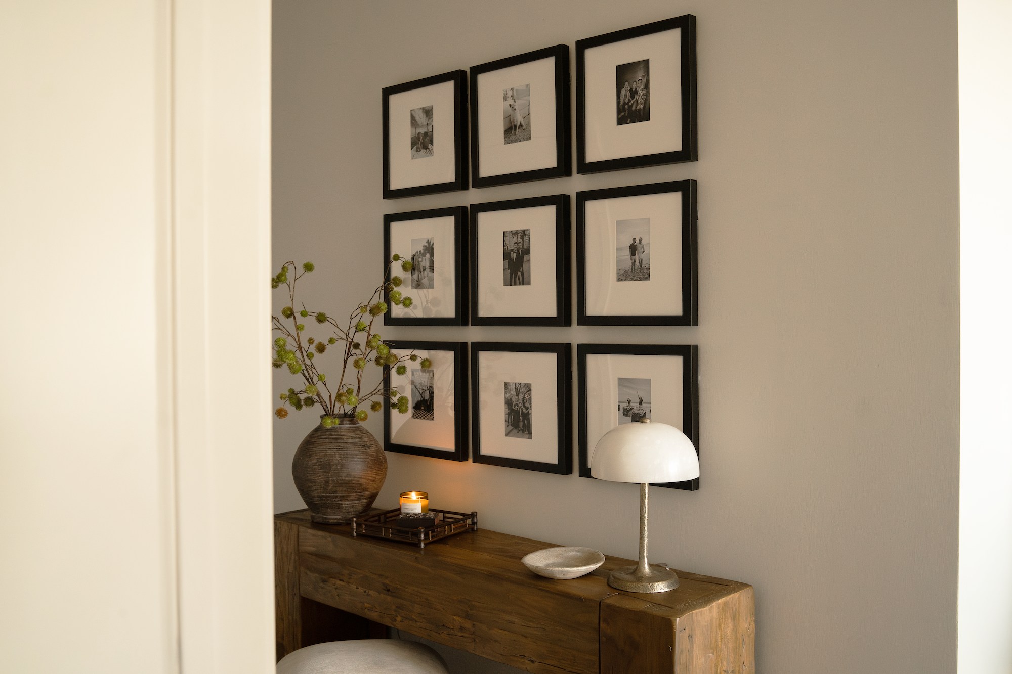
Luxe Vertical Grid ($981): Bobby Berk describes this layout as "like an Instagram feed for your wall," and recommends it over a sofa, console, or large wall. Uniform 2-inch spacing between frames keeps the grid crisp.
Luxe Staircase ($953): Frames follow the slope of the staircase with centers tracking roughly 57 inches above each tread. Bobby Berk notes that it is "the perfect place to display family photos."
Luxe Bricklay ($1,074): This layout is Bobby Berk's most versatile option, described as "versatile, simple, and symmetrical," and uses two different frame sizes in a staggered brick pattern. CNN Underscored's Stephanie Griffin confirmed it "looked professionally installed" after using the Frameology system, and called it worth the hype for its premium materials and foolproof hanging system.
Museum style gallery wall ideas for 2026
The 2026 direction in high-end interiors leans into deliberate restraint. Gallery walls in 2026 trend toward curated restraint, mixing scales and mediums while intentionally using negative space and aligning centerlines at eye height. A few core principles define this museum-style approach.
Odd numbers: Aim for an odd number of pieces, such as five, seven, nine, or eleven, combined with one dominant hero piece sized 1.5 to 2 times larger than average frames. Odd groupings feel more natural to the eye than even ones.
60–75% wall coverage: Artwork should occupy 60–75% of available wall space above furniture to achieve proportional, intentional layouts without clutter.
Eye-level centerline: The center of every gallery wall arrangement should sit at exactly 1,450 mm above the finished floor, which aligns with the museum and gallery standard worldwide.
Mixed scales with breathing room: Varying artwork sizes, with larger pieces drawing the eye and smaller works filling gaps, establishes visual rhythm and hierarchy without sensory overload.
High end gallery wall spacing rules that always work
The industry standard for gallery walls is 2–3 inches between frames, with the arrangement centered at the 57-inch eye-level line established earlier. The guidance below turns that rule into clear placement steps you can follow in any room.
These additional placement rules apply across every layout, whether you choose Luxe Wall, Luxe Wall Wide, or another frame family.
Above furniture: Leave 6–10 inches between the top of furniture and the bottom of the lowest frame, with 8–10 inches working best for visual anchoring.
Furniture width ratio: Plan for the gallery wall arrangement to span about 60–75% of the furniture width below it.
Negative space hierarchy: Limit frame coverage to 50–70% of the wall area so you preserve negative space and avoid visual clutter.
Best way to arrange a gallery wall in 2026
The updated 2026 approach prioritizes curated restraint over maximalism. Refined arrangements always leave breathing room so each piece can stand on its own, maintaining the 60–75% coverage ratio discussed earlier while treating negative space as a deliberate design element. Three principles define the most effective arrangement strategy this year.
One unifying finish: Designers unify disparate images by using a consistent frame finish, such as all warm oak or all matte black, rather than matching content, which creates cohesion without visual chaos. Frameology's Luxe line offers matte black, warm wood, and antique gold finishes across all four frame families.
Negative space as a design element: Professional gallery walls maintain consistent 2–3 inch gaps between frames, since varying gaps cause the eye to read the arrangement as random and cluttered.
Anchor-first sequencing: Start with an anchor piece placed slightly off-center, then build outward while maintaining identical spacing on all sides.
Start framing your favorite memories at Frameology.
What makes a gallery wall look expensive
The difference between a gallery wall that feels collected and one that feels assembled comes down to materials and proportion. Deep mats between 6–8 cm read as vintage, museum-quality, and expensive on gallery walls, and they act as the composition's unifier across mixed-finish frames. Several other details also communicate quality.
Three-finish maximum rule: Limit a gallery wall to three frame finishes maximum, with one dominant finish on the largest pieces, so the wall reads as a curated collection rather than chaos.
Acid-free mats and UV acrylic: For paper-based prints, acid-free mats and UV-protective glazing provide both preservation and a polished, intentional presentation. Every Luxe frame from Frameology includes acid-free mats and UV-protecting museum-grade acrylic as standard.
Sealed backings: Frameology's Luxe frames feature a sealed, permanent kraft paper backing that protects the custom-framed photo permanently, which signals museum-grade craftsmanship.
Consistent mat depth: Use a single mat color and a single mat depth across the entire gallery wall, since variations in mat treatment weaken the unifying effect.
Luxe gallery wall mistakes to avoid
Even well-chosen frames can create a cluttered result when a few common errors creep in. These mistakes most reliably undermine a high-end gallery wall.
Overcrowding: Exceeding the 60–75% coverage guideline by cramming frames into every available inch results in a busy rather than intentional gallery wall look.
Hanging above eye level: Hanging artwork with its center above 60 inches from the floor is a common mistake, since it forces viewers to crane their necks and makes even high-quality pieces feel inaccessible and off-balance.
Starting without an anchor: Starting with corner pieces instead of the anchor piece produces an arrangement that reads as a random collection rather than a curated composition.
Oversized anchor gallery wall layout
The oversized anchor approach offers the most reliable path to a gallery wall that feels editorial rather than assembled. In salon-style gallery walls, identify the largest frame as the anchor piece, hang it first at the standard museum centerline, then build the rest of the arrangement outward from it.
The Luxe Bricklay is purpose-built for this approach. One large Luxe Wall Wide frame anchors the composition, and supporting pieces in two sizes layer outward using uniform 2.5-inch spacing. Designers identify using too many small pieces as one of the most common mistakes because it causes the arrangement to feel scattered, while anchoring with one or two larger works establishes visual gravity.
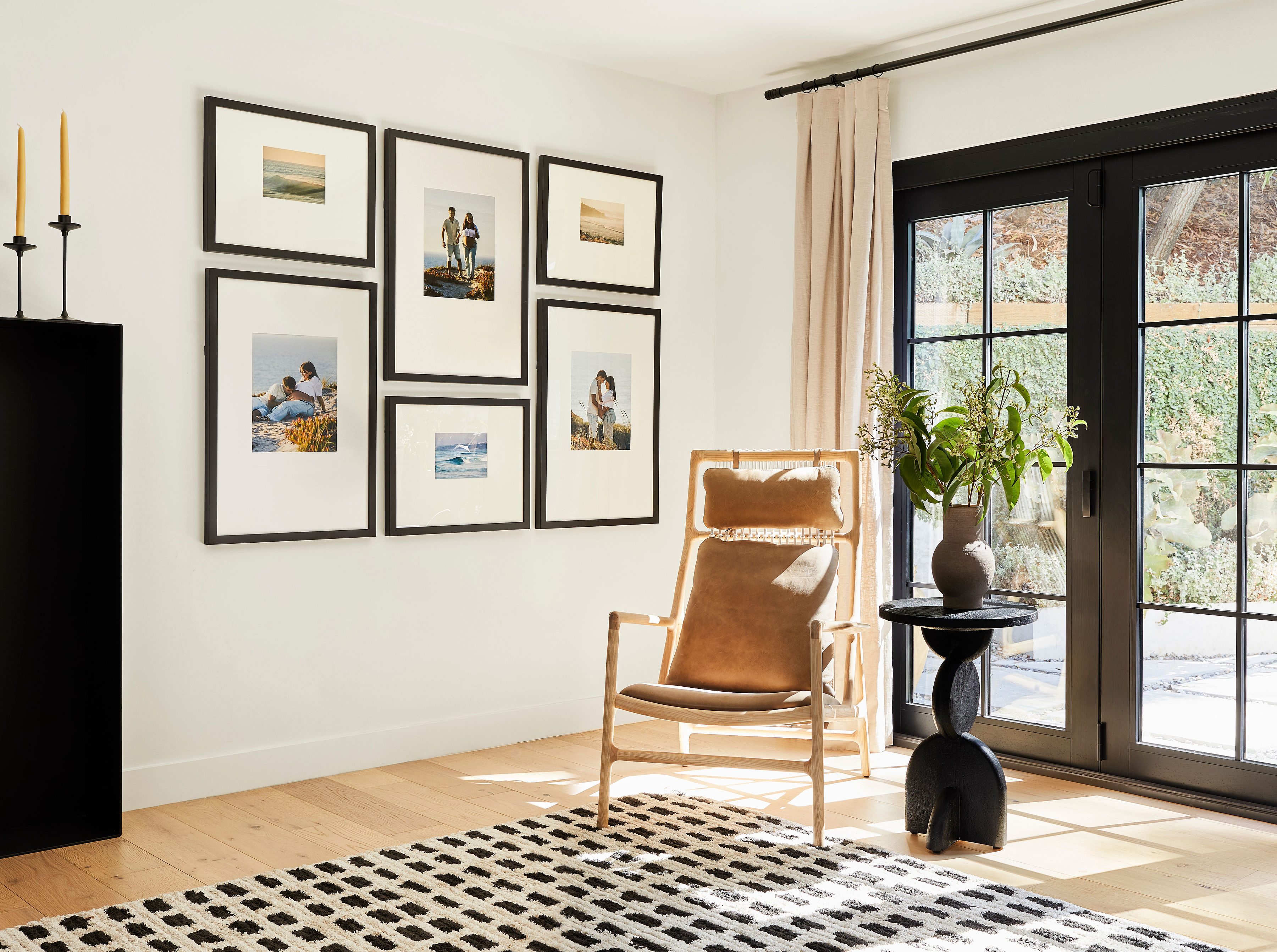
For the Luxe Vertical Grid, the anchor shifts to the top-center frame, and the eye travels downward through the grid. For one large focal frame paired with smaller ones, group the small frames into a tight cluster with 1-inch internal spacing and maintain the standard 2–3 inches from the cluster to the large frame so the cluster reads as a single visual unit.
How to install a Luxe gallery wall with the life-size template
Every Luxe gallery wall from Frameology includes a custom, life-size printed gallery wall template and all necessary hanging hardware. Frameology ships frames with a true-to-size paper template and nails to mark exact hanging positions on the wall. The Luxe installation process uses a dual-point hanging system, with two side hangers per frame for perfect leveling, which differs slightly from the Classic single-center-point process.
Here is the full Luxe installation sequence:
Tape the template: Unroll the life-size gallery wall template and tape it to the wall at the correct height, with the centerline at 57 inches from the floor.
Create dimple marks: Press firmly through the template at each marked nail point to create a dimple in the wall surface.
Hammer nail holes: Drive nails lightly into each dimple mark through the template.
Remove the template: Carefully peel the template away from the wall, leaving the nails in place.
Hammer plastic markers and nails: Seat the included plastic wall markers and drive nails to the correct depth using the included hardware.
Hang your frames: Engage both side hangers on each Luxe frame onto the corresponding nails, then use the included mini-level to confirm each frame is perfectly level.
For a visual walkthrough, Frameology's step-by-step Luxe gallery wall installation video covers the full process. House Beautiful contributor Janae McKenzie put it plainly: "I would absolutely recommend Frameology to anyone who knows they want a gallery wall, but doesn't know how to make it happen,"
Starting at $638, Frameology's Luxe gallery walls are hand-framed in the United States. With over 7,500+ verified 5-star reviews and a 4.98/5 overall rating, the results speak for themselves. Learn more about why Frameology stands apart in this cornerstone guide to why Frameology is the best online framing service.
Frequently asked questions
What's the best spacing between frames for a high-end gallery wall?
The standard recommendation across design professionals is 2–3 inches between frames, measured edge to edge. For frames up to 16×20 inches, 2 inches works well in tight grid layouts. For frames 18×24 inches and larger, 2.5–3 inches provide better visual breathing room. In mixed-size salon-style arrangements, choose one consistent measurement, and 2.5 inches is a reliable default, then apply it uniformly across every gap. Consistency matters more than the exact number, since even a half-inch variation reads as imprecision from a normal viewing distance.
Do all gallery walls include hanging templates?
Classic and Luxe gallery walls include a life-size gallery wall template that makes installation simple and straightforward. Canvas galleries, Metal galleries, and gallery walls created using Frameology's Gallery Wall Design Service do not include templates because their construction and customization work differently and often need more tailored installation approaches.
How many frames should a high-end gallery wall have?
Most design professionals recommend odd numbers, such as five, seven, or nine pieces, because odd groupings create a natural focal hierarchy that keeps the eye moving. The arrangement should include at least one anchor piece sized 1.5 to 2 times larger than the average frame, supported by medium and smaller accent pieces. Wall coverage should land between 60–75% of the available wall area, which leaves intentional negative space on all sides. Fewer, larger pieces with generous spacing consistently read as more editorial than many small frames packed together.
What are the most common mistakes that make a gallery wall look cluttered?
The five most reliable culprits are inconsistent spacing between frames, mixing more than three frame finishes, hanging the arrangement too high on the wall so the center sits above the 57–60 inch guideline, overcrowding beyond the recommended coverage, and starting the layout from a corner piece rather than the anchor. A gallery wall also loses its collected quality when there's no visual common thread, whether that is frame finish, mat color, subject matter, or color palette, tying the pieces together.
Start framing your favorite memories at Frameology
A high-end gallery wall isn't about filling a wall, it is about editing it. Consistent 2–3 inch spacing, a single dominant finish, an anchor piece at 57 inches, and museum-grade Luxe materials do most of the work. Frameology's Luxe gallery walls arrive with every frame printed, matted, and ready to hang, plus a life-size gallery wall template and all hardware included. The result looks like a designer handled the installation.
Start framing your favorite memories at Frameology.
