


Glossy vs. matte photo prints: which finish is best?
Written by: Daniel Koren, Co-Founder, Frameology
Key takeaways
Matte and luster finishes work better than glossy behind glass because they reduce glare, prevent sticking, and stay readable from any angle in typical home lighting.
Glossy prints can create double reflections and adhesion issues behind standard glass, which makes them risky in bright or multi-window rooms.
Room lighting and viewing angle matter most. Matte or luster is usually safest for sunlit living areas, hallways, and kitchens, while glossy works best in controlled, low-light spaces.
Luster — also called satin or pearl — offers a practical middle ground. It delivers vibrant color with less glare and better fingerprint resistance, so it fits most homes.
Frameology makes finish choices simple with ready-to-hang frames in matte or luster and an augmented reality (AR) preview tool so you can see how your print will look before you order at Frameology.
Why matte usually beats glossy in photo frames
Glossy prints struggle behind glass because glass already reflects light. A glossy print adds a second reflective layer underneath it. That combination creates two reflective surfaces that can double the glare, so your framed photo starts to behave like a mirror in bright conditions. Beyond glare, glossy paper can stick to the glass surface over time, which can cause damage or air bubbles that are hard or impossible to fix.
Matte paper avoids both problems. Matte paper absorbs light instead of bouncing it, so it stays readable from almost any angle, no matter where your windows or lamps sit. Colors look slightly softer and more refined. They feel less punchy than glossy, but they never look washed out. In a bright living room with large windows, that subtle look feels intentional and polished.
Glossy prints still have a real strength: they deliver stronger color contrast, higher perceived saturation, and sharper visual detail. In a room with controlled lighting, such as a bedroom with blackout curtains, a media room, or a hallway lit by a single sconce, glossy can look stunning. When glossy prints sit behind glass, museum glass or anti-reflective glass helps reduce the double-reflection problem. Without that upgrade, glossy behind standard glass feels like a gamble in most homes.
In a bright living room, a low-light hallway, or an office with overhead fluorescents, matte usually gives you the most reliable result. It handles almost every lighting condition calmly, which sets up the room-by-room choices that come next.
How room type affects glossy vs. matte framed prints
Room context shapes which finish works best. Professional photographers recommend matte finishes for multi-window rooms, sunlit living areas, kitchens, and stairwells because glare control matters most in those spaces. A kitchen with overhead fluorescents and a window above the sink creates one of the toughest environments for glossy framed prints. Light hits from several angles at once, and the frame becomes hard to see clearly throughout the day.
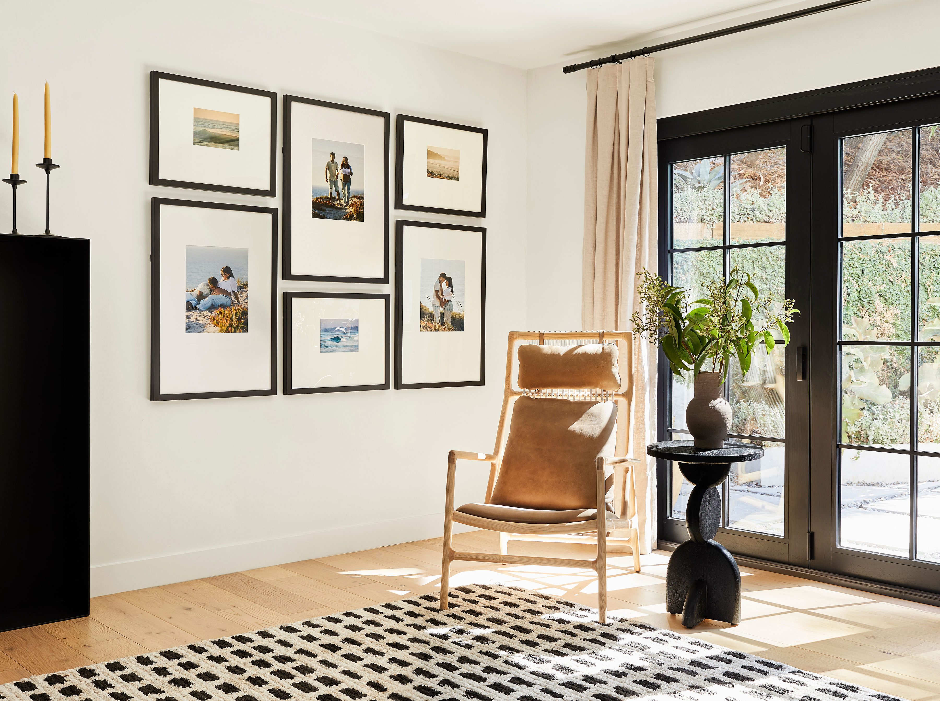
Hallways create a different challenge. They tend to be narrow, so you usually walk past frames at an angle instead of standing right in front of them. Matte prints keep a consistent look from any viewing angle, which makes them a natural fit for corridor displays. Glossy prints shift more dramatically as you move, especially when the light source sits behind you or to the side.
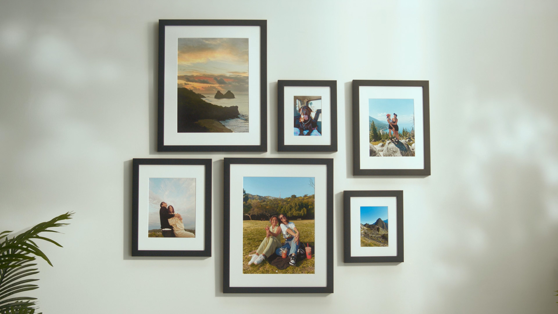
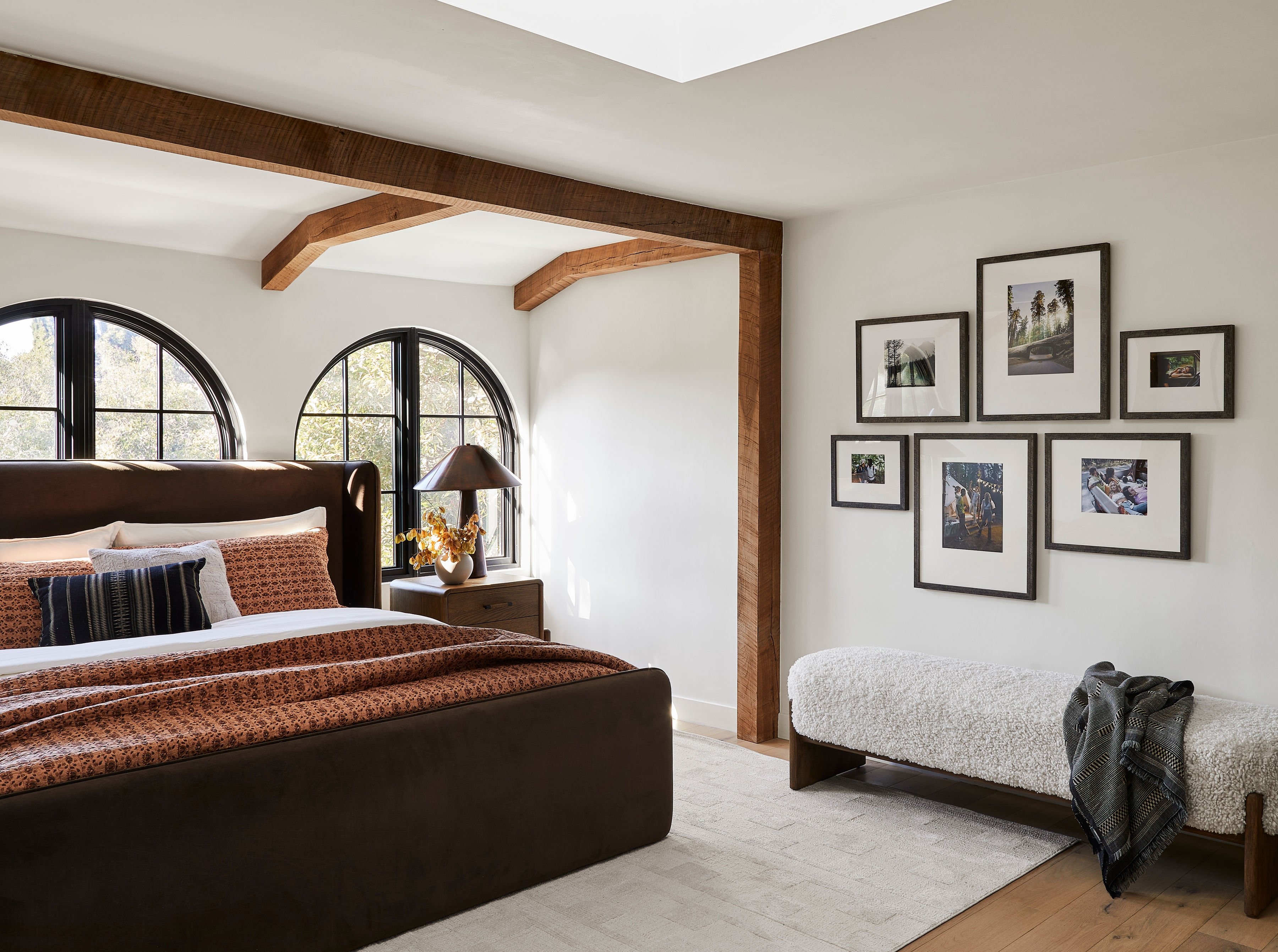
Bedrooms and home offices give you more flexibility. Lighting in these rooms usually stays easier to control than in multi-window living spaces, so glossy or luster can work well when you plan placement carefully. A framed print hung directly opposite a window in a bedroom will still catch glare. A print on a wall perpendicular to that same window, where direct light rarely lands, can handle a glossier finish without trouble.
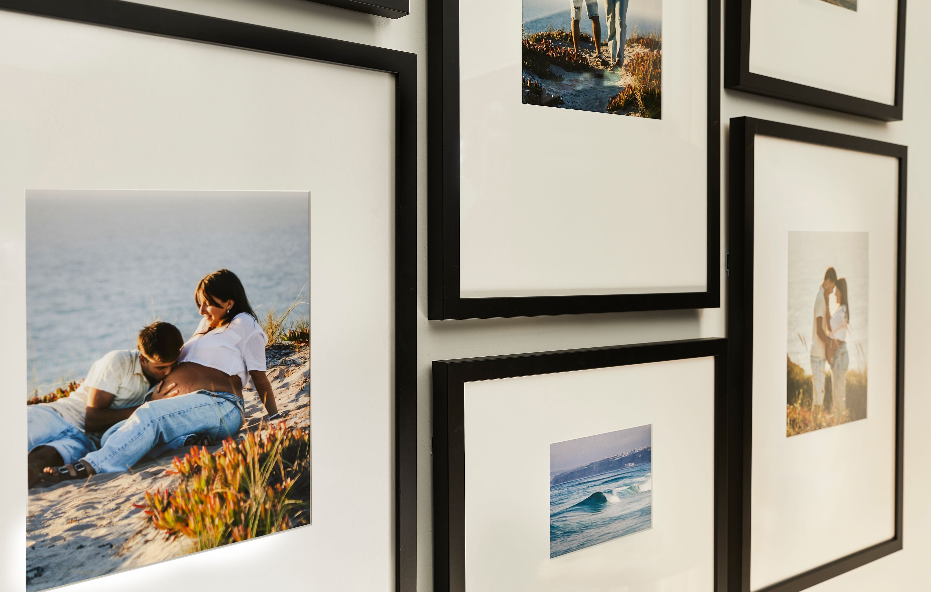
Handling also plays a role. Matte prints resist fingerprints and smudges better than glossy prints because of their non-reflective surface. Before a print goes into a frame, people touch it, sometimes several times. Matte paper hides that handling. Glossy paper records every fingerprint.
Luster vs. matte for everyday wall art
Luster, sometimes called satin, semi-gloss, or pearl, sits between glossy and matte. For most homes, it works as the most practical finish of the three. Luster's textured semi-gloss sheen diffuses light instead of reflecting it, so prints stay easy to view from several angles and still look good near windows, under spotlights, or in bright hallways. It delivers more color vibrancy than matte while avoiding the adhesion risk and double-glare problem that glossy can create behind glass.
Luster keeps much of glossy paper's color strength while adding a subtle texture that cuts glare and hides fingerprints. That mix explains why many professional photographers treat luster as their standard choice when they need consistent results in different homes and lighting setups. It works across a wide range of rooms instead of excelling in just one.
Compared to matte, luster adds noticeable color punch. Satin finishes deliver about 60% of glossy's color lift with far less glare. Portraits, travel photos, and family shots keep warmth and depth without the harsh reflections that glossy can introduce behind glass. Luster prints also render skin tones more accurately than glossy prints, which helps them look warm and true instead of oversaturated in framed displays. That accuracy matters when you frame portraits or wedding photos.
Matte still shines for black-and-white photography and fine art prints where tone and texture matter more than color. Matte finishes create zero reflection and glare with the flattest colors. That quality makes them the classic choice for black-and-white fine art prints, where the lack of shine lets tonal gradation stand out. For most color photography in a typical home, luster usually offers more flexibility.
Best finish behind glass in Classic Wall and Luxe Wall frames
Photographer Sean Lewis, writing for SLR Lounge in July 2026, notes that matte offers minimal sheen for accurate color, luster provides a low sheen and often appears as the default print option, and gloss delivers maximum sheen that boosts rich colors. That breakdown mirrors what many professional photographers use in practice. Luster works as the everyday default, matte supports fine art and specific aesthetics, and glossy stays reserved for spaces with carefully managed lighting.
High-traffic areas or frequently handled prints benefit from luster or matte finishes. Prints that sit opposite windows or under direct lighting should avoid glossy because glass framing intensifies glare on glossy paper. Wedding and portrait photographers often choose luster prints because the satin surface handles different skin tones and lighting while resisting fingerprints. That reliability matters when those prints later sit behind glass in clients' homes.
This same thinking shapes Frameology's framed print options. The Classic Wall, starting at $59, uses continuous-tone archival printing on premium photo paper and ships quickly, usually arriving within a week, which makes it a fast path from photo to wall. The Luxe Wall, starting at $79, is crafted from premium wood molding and metal moldings with acid-free mats and UV-protecting museum-grade acrylic, and arrives in 7–10 business days. Both lines arrive ready to hang with the finish already chosen and applied, so you skip lab visits and guesswork.
Frequently asked questions
How much does finish matter once a print sits behind glass?
Finish still matters a lot behind glass, although for slightly different reasons than with unframed prints. Glass protects the surface from fingerprints and handling, which removes one of glossy's main weaknesses. Glare and adhesion issues from glossy behind standard glass still remain, though. Matte and luster finishes reduce glare, prevent sticking, and stay readable from several angles, which glass alone cannot guarantee. Museum-grade or anti-reflective glass makes glossy more workable, but for standard glass in typical home lighting, matte or luster usually offers a safer choice.
Which finishes work in Frameology Classic Wall and Luxe Wall frames?
Frameology uses continuous-tone archival printing on premium photo paper for all framed prints, which supports rich color and sharp detail. The Classic Wall, starting at $59, and the Luxe Wall, starting at $79, both aim to show your photo at its best. When you upload your image and customize your order on Frameology's website, Frameology handles the framing details. You focus on frame style and size, while printing stays tuned for framed display from the start.
Is luster the same as satin or pearl?
Luster, satin, and pearl all describe the same general type of finish. Each one refers to a semi-gloss surface with a slight texture that sits between glossy and matte. Labs and manufacturers use different names, but the main traits stay the same. You get less glare than glossy, more color vibrancy than matte, and a fine texture that resists fingerprints and prevents sticking to glass. Professional photographers often default to this finish for portraits, weddings, and framed display prints.
Do all gallery walls include a gallery wall template?
Classic and Luxe gallery walls include life-size gallery wall templates that make installation straightforward. Canvas galleries, Metal galleries, and gallery walls created with Frameology's Gallery Wall Design Service do not include templates. Those options use different construction and customization methods and often need more tailored installation approaches.
Classic Wall vs. Luxe Wall frames at Frameology
The Classic Wall, starting at $59, works as Frameology's value tier. It offers strong quality, fast shipping, and a standard removable backing so you can swap photos whenever you like. Classic Wall frames usually arrive within a week. The Luxe Wall, starting at $79, serves as Frameology's museum-quality option. It is crafted in the USA from premium wood molding and metal moldings with acid-free mats and UV-protecting museum-grade acrylic. Luxe Wall frames take 7–10 business days because of their more detailed construction.
The finish decision and frame decision work together. Matte and luster finishes usually perform best in most home lighting conditions behind glass, and both Classic Wall and Luxe Wall frames are built to highlight that result. Whether you are decorating a first apartment or planning a long-term display, the right finish paired with the right frame helps a photo feel like it always belonged on that wall.
