


How to turn your phone photos into an editorial gallery wall
Written by: Daniel Koren, Co-Founder, Frameology
Key takeaways
An editorial gallery wall is a curated, intentional composition that reads as one cohesive design statement.
Start with a few phone photos that share a unifying theme, color story, or mood, then edit them with consistent settings or a black-and-white conversion.
Use matching frames, keep spacing around two to three inches, and hang the composition at eye level for a polished, magazine-style result.
Most modern smartphones from 2020 or newer have enough resolution for quality prints up to 30×40 cm, so your camera roll already holds wall-worthy images.
Frameology simplifies every step with curated gallery wall layouts, life-size templates, and premium framing, so you can explore Frameology's curated gallery walls with confidence.
What an editorial gallery wall looks like
An editorial gallery wall treats the wall as one design decision, not a series of unrelated frames. As a 2026 guide by Moderna Quadros describes it, a gallery wall is “a curation — an editorial decision about what deserves space, in what order, and with what intention.” A curated gallery has a clear point of view that separates it from organized clutter.
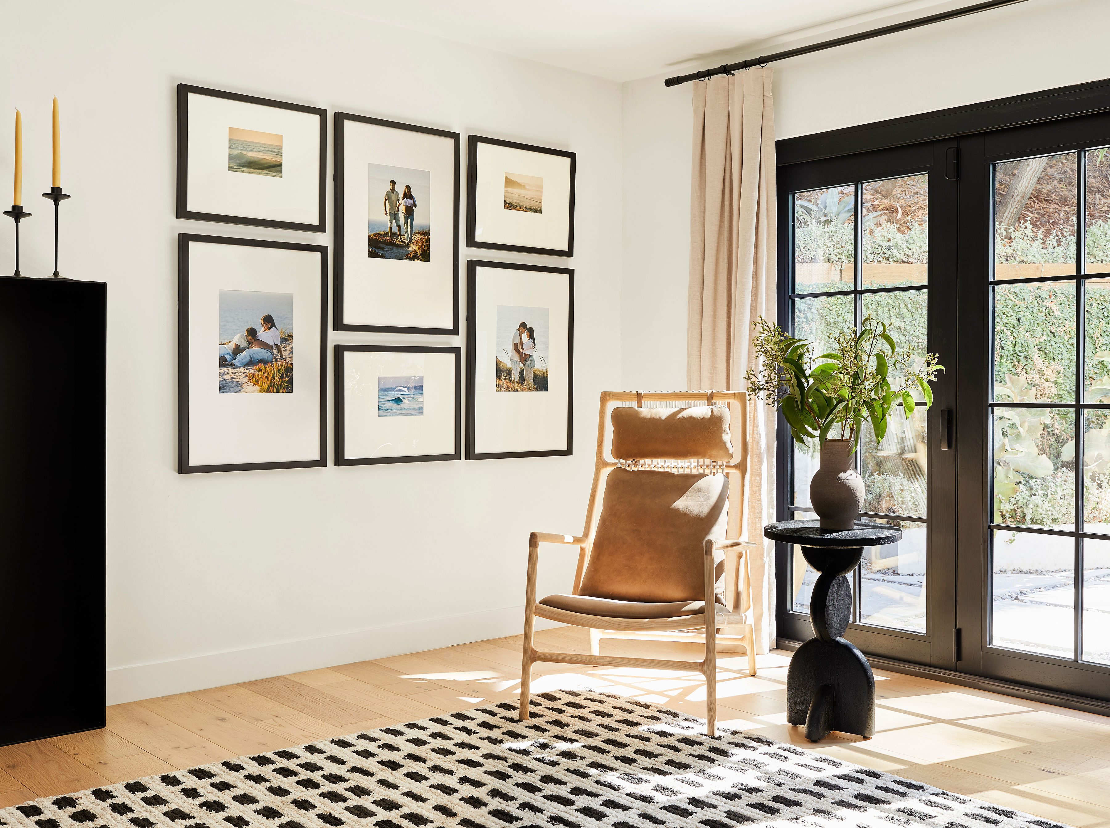
Key characteristics of an editorial gallery wall include:
A unifying theme or color story that ties every image together
Consistent framing, such as matching finishes, matching mat widths, or a tightly controlled palette of two to three frame styles
Intentional negative space between frames, typically two to three inches, so the composition reads as one piece
A clear visual anchor, which is one photograph with enough emotional weight or compositional strength to organize everything around it
Editorial style focuses on intention and clarity. Frameology's curated gallery walls, including the Luxe Bricklay designed with Bobby Berk, follow this approach with pre-designed layouts that remove guesswork from composition.
How to turn your phone pictures into wall art
This process follows six clear steps. Move through them in order and you’ll build an editorial gallery wall with less effort.
Curate with intention: Select five to nine photos that share a common thread, such as a color palette, a trip, a mood, or a mix of subjects that feel like they belong in the same room.
Edit for cohesion: Apply the same filter or preset to every photo, convert all to black-and-white, or standardize warmth and contrast across the set so the collection feels unified.
Check resolution before printing: Zoom in on your phone screen. If the image looks pixelated at that scale, stick to smaller print sizes like 4x6 or 5x7. Smartphone photos from 2020 or newer (iPhone 11+, recent Samsung and Pixel flagships) usually meet the minimum resolution of 3,000×2,000 pixels for a 30×40 cm frame, which works for most gallery wall print sizes.
Choose consistent frames: Matching frames in black, white, or natural wood create instant cohesion. White mats give small prints gallery-like presence and breathing room. Interior designer Sarah Miller recommends mats at least two to three inches wide and notes that undersized mats are one of the most common framing mistakes.
Plan your layout before hammering: Use paper templates or Frameology's life-size gallery wall template to test the arrangement on your wall before you commit to nails.
Hang at eye level: Center the entire composition at 57–60 inches from the floor, with two to three inches between frames. Above a sofa, aim for a gallery that spans roughly two-thirds of the furniture width, with the bottom edge about 6–10 inches above the back.
Curating photos from your phone with a clear point of view
Curation works like subtraction. Start with 20–30 candidate images, then edit down until only the strongest remain. PhotoMocha recommends choosing one visual anchor photograph with enough scale or emotional weight, surrounded by quieter supporting images such as hands, doorways, shadows, and candid moments. This structure gives the eye a clear path through the wall.
Choosing a theme speeds up editing and strengthens the final result. These three approaches work especially well:
A color story: Use all warm-toned images, all cool-toned images, or a palette anchored to one recurring hue such as a blue coat, a terracotta wall, or a patch of green.
A subject thread: Focus on architecture, shadows, candid travel moments, or golden-hour portraits. The subject can vary from frame to frame as long as it feels related.
A mood: Build around black-and-white documentary style, soft film grain, or high-contrast editorial style. Photographic style unifies mixed subjects without visual conflict.
The 60-30-10 rule from interior design applies directly to gallery wall curation: 60% dominant tone, 30% secondary tone, and 10% accent. You can apply this ratio to color temperature, subject weight, or frame size distribution so the composition feels balanced and natural.
Frameology's curated gallery wall layouts, from the Classic Stack to the Luxe Vertical Grid, show how professional designers think about composition. Bobby Berk describes the Luxe Vertical Grid as “like an Instagram feed for your wall” which means the layout handles structure while you focus on choosing photos.
Editing for a cohesive, magazine-worthy look
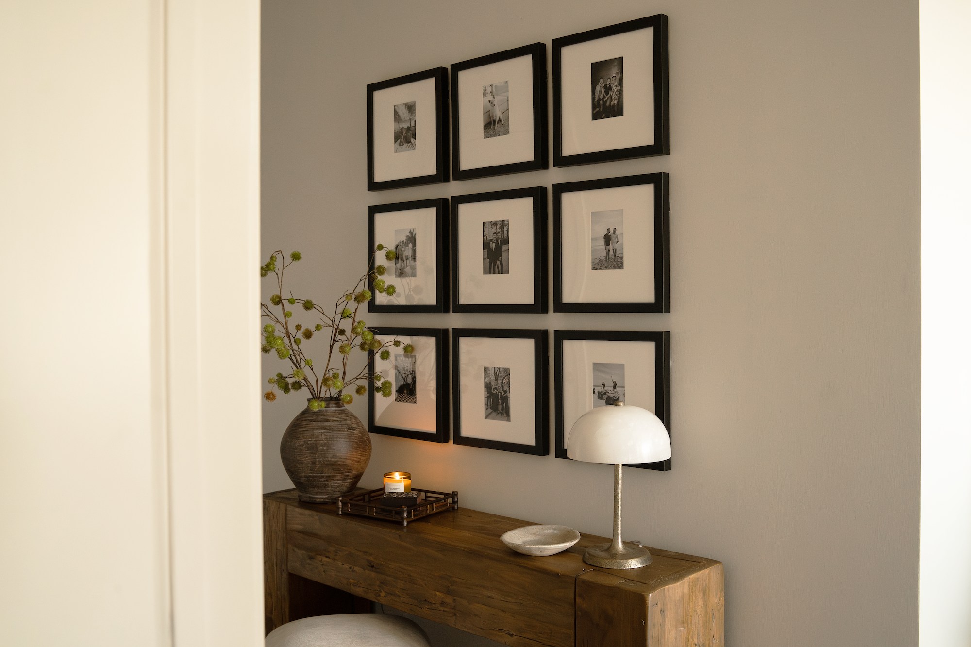
Consistent editing makes phone photos feel like a single, intentional series. For most people, the easiest path is applying one preset or filter to every image. Converting photos to black-and-white automatically eliminates about 70% of consistency problems, which makes it a powerful editorial shortcut. If you keep color, standardize three settings across all photos: color temperature, contrast, and saturation.
Free tools like Snapseed and VSCO create professional results without a Lightroom subscription. Framky's guide on colour consistency recommends VSCO presets A6 (slightly warm and filmic), C1 (classic and neutral), and F2 (muted and versatile) as reliable choices for gallery sets. The guide suggests avoiding heavily stylized presets that can date quickly.
Cropping also shapes the editorial feel. Tight crops on textures, architectural details, and strong shapes read more artfully than standard snapshots. Heavy filters that crush shadows or oversaturate skin tones often print poorly. Laguna Digital advises making only small edits before printing because aggressive filters can make skin look unnatural and cause shadows to disappear on paper. Aim for photos that could sit together in the same magazine spread.
Printing phone photos without losing quality
Modern phones capture more detail than most people expect. Many smartphone cameras exceed 12 megapixels, which is enough for professional-quality prints up to A3 size. A 12-megapixel file reaches 300 DPI (dots per inch) on a 20×30 cm print without visible quality loss.
These three rules prevent most printing disappointments:
Always use the original camera file: Screenshots, social media downloads, and messaging-app copies are usually compressed and lose detail when printed. Upload directly from your camera roll.
Print at 300 DPI for sharpness: For iPhone photos, 4x6 or 5x7 prints work for almost any image, 8x10 or 11x14 suit newer iPhones, and 16x20 and above call for careful editing and high resolution.
Choose paper wisely: Matte or lightly textured paper softens glare and flatters portraits and pale landscapes, while glossy paper deepens blacks but shows reflections and fingerprints. Matte and semi-gloss usually feel more refined in a gallery wall.
Frameology pairs each medium with best-in-class printing technology, including continuous-tone archival printing on premium photo paper for framed prints. This approach supports accurate, gallery-level color reproduction on every order.
Browse Frameology's framed picture collection.
Choosing frames and mats for an editorial look
Frames and mats either unify your photos or compete with them. The editorial aesthetic favors consistency over variety, so matching frames in black, white, or natural wood create instant cohesion. White mats act as the most effective tool for turning small phone prints into gallery-worthy pieces because they add breathing room, visual weight, and clean negative space.
For a more collected look, interior designer Sarah Miller suggests choosing a maximum of two or three frame finishes and repeating them throughout the arrangement. Every finish should appear at least twice so the wall feels intentional instead of accidental.
Frameology offers two framing tiers that support different editorial goals. The Classic Wall, starting at $59, uses Classic frames with a removable backing that makes photo swaps simple. The Luxe Wall, starting at $79, uses museum-quality frames that are hand-crafted in the United States with a sealed backing for a permanent display. Classic gallery walls, starting at $198, and Luxe gallery walls, starting at $638, both include a life-size gallery wall template for straightforward installation. For a detailed comparison, Frameology's Classic vs. Luxe guide explains every distinction.
As House Beautiful contributor Janae McKenzie noted, “The most innovative part of Frameology is the ability to upload photos directly from your phone's camera roll to the site,” which makes the framing process feel as natural as scrolling through your photos.
Arranging and hanging your gallery wall
Planning the layout removes most of the stress from hanging multiple frames. Professionals usually arrange frames on the floor first, then transfer the layout to the wall with templates. Interior designer Jennifer Davis recommends laying out frames on the floor or using paper templates on the wall to test different arrangements before you pick up a hammer.
These hanging guidelines appear across interior design advice:
Keep spacing consistent at two to three inches between frames. An inch of drift between two pairs of frames is noticeable to visitors.
Center the overall composition at eye level instead of centering each individual frame.
Above a sofa, let the gallery span about two-thirds of the furniture width, with the bottom edge roughly 6–10 inches above the back.
Fill about 70 to 75 percent of the wall so the arrangement feels anchored instead of scattered.
Frameology removes the hardest part of installation. Every Classic gallery wall includes a custom, life-size gallery wall template: tape it to the wall, hammer nails into the marked spots, remove the template, and hang your frames in under an hour. Every Luxe gallery wall includes the same life-size template plus all necessary hanging hardware: nails, a mini-level, and a dual-point hanging system for precise leveling and long-term stability.
CNN Underscored's Stephanie Griffin, after testing the Luxe Bricklay system, reported, “The Luxe Bricklay is called 'luxe' for a reason. Between the premium materials and foolproof hanging system that saved so much time and stress, it's worth the hype.” Plus, Apartment Therapy's Katie Maguire described the experience as “seamless from beginning to end,” praising the upload tool, fast shipping, and secure packaging.
Common mistakes to avoid
Most gallery wall problems fall into a few predictable patterns. Keeping these in mind helps you sidestep them from the start.
Hanging too high: Center the composition at eye level instead of aligning it with the visual center of the wall.
Inconsistent spacing: Drifting gaps make a curated wall feel chaotic. Use a physical spacer or cardboard square to keep gaps identical.
Too many small pieces: Small frames scattered across a large wall feel cluttered. Grace Brackman of Maggie Griffin Design recommends adding mats to increase the scale of small photos, especially in hallways.
Skipping the edit: Mixed color temperatures and inconsistent filters can make photos feel like a fridge door at scale, as Fab Art's gallery wall guide describes.
Printing low-resolution files: Screenshots and social media downloads usually look pixelated in print. Always use original camera files.
Forgetting the room: Jerad Gardemal of JF Gardemal Designs notes that a gallery wall should relate to nearby elements such as a rug, lamp, or window instead of floating alone on the wall.
Your editorial gallery wall starts here
An editorial gallery wall can transform a room with a single design move. Moderna Quadros calls it “the only decorative intervention that can completely transform a room without touching the walls, floor, furniture, or lighting.” Your phone already holds the raw material.
The secret lies in curation, consistency, and the right tools. Frameology supports each step. Upload photos directly from your phone, preview frames on your wall with the mobile AR (augmented reality) tool, choose a curated gallery wall layout, and hang using a life-size gallery wall template that guides every nail. Classic products focus on value and flexibility, while Luxe products deliver museum-quality craftsmanship, all hand framed in the United States. For a deeper look at what sets Frameology apart, this guide covers everything you need to know.
Begin your editorial gallery wall with Frameology.
Frequently asked questions
What does “editorial” mean when describing a gallery wall?
An editorial gallery wall builds around a deliberate point of view. It uses a curated selection of images that share a common thread such as color palette, subject, mood, or photographic style. Those images sit in consistent frames with intentional spacing so the wall reads as one cohesive composition. The term comes from magazine and editorial photography, where every image earns its place and the selection communicates something specific. An editorial gallery wall depends on clear visual logic and the discipline to leave out anything that does not support that logic.
What kind of photos work best in a gallery wall?
The strongest gallery walls rely on photos that share at least one unifying element. That element might be a consistent color temperature, a recurring subject such as travel or architecture, or a unified photographic style like black-and-white or film grain. Start with 20–30 candidate images and edit down to five to nine. Choose one visual anchor with strong composition or emotional weight, then surround it with quieter supporting images. Aim for a focused selection instead of including every favorite photo. Photos from iPhone 11 and newer, along with recent Samsung and Pixel flagships, usually support most gallery wall print sizes without visible quality loss.
How can I make cell phone pictures look professional when printed?
Three practices have the biggest impact. First, always upload the original camera file instead of a screenshot, social media download, or messaging-app copy, since those versions are compressed and lose detail. Second, apply consistent edits across every photo in the set, using the same preset, color temperature, and contrast level. Consistency across the set matters more than perfection in any single image. Third, match print size to your file's resolution. Sizes like 4x6 and 5x7 work for almost any phone photo, while 8x10 and 11x14 suit newer smartphones with higher resolution. Frameology uses continuous-tone archival printing on premium photo paper for framed prints, which supports gallery-level color reproduction whether the source file comes from a professional camera or a phone.
Do all gallery walls include hanging templates?
Classic gallery walls and Luxe gallery walls include life-size gallery wall templates that make installation straightforward. Canvas galleries and gallery walls created through Frameology's Gallery Wall Design Service don’t include templates because their construction and customization work differently and often call for more tailored installation approaches.
What's the difference between Frameology's Classic and Luxe gallery walls?
Classic gallery walls, starting at $198, use Classic frames with a removable backing so you can swap photos whenever you want. This flexibility suits anyone who likes to refresh displays over time. Classic frames hang from a single center point per frame, and each Classic gallery wall includes a life-size gallery wall template for installation. Classic products usually ship the next business day and typically arrive within a week.
Luxe gallery walls, starting at $638, use museum-quality frames that are crafted with premium wood and metal moldings and UV-protecting museum-grade acrylic. Luxe frames feature a sealed, permanent kraft paper backing, so photos stay in place for a long-term display, and they hang from two side points for precise leveling and stability. Every Luxe gallery wall includes a life-size gallery wall template plus all necessary hanging hardware: nails, plastic markers, and a mini-level. Luxe products take seven to ten business days because of their artisan craftsmanship.
