


Easy gallery wall templates for arranging living room frames
Written by: Daniel Koren, Co-Founder, Frameology
Key takeaways
Gallery wall templates remove guesswork and prevent crooked or over-spaced layouts by letting you preview the full arrangement before you pick up a hammer.
Five proven living-room layouts, including grid, horizontal row, vertical stack, offset staircase, and mixed-size cluster, follow the two-thirds rule and 2–3 inch spacing for balanced results.
Center the entire arrangement at 57–60 inches from the floor and leave 7–10 inches above furniture so the display feels visually connected to the room.
Common mistakes like over-spacing, inconsistent gaps, and hanging too high are easy to fix when you re-measure to the 2–3 inch spacing and 57–60 inch center-line standards.
Frameology’s ready-made Classic and Luxe gallery walls arrive with custom life-size templates and optional hardware, so you can turn a blank wall into a polished display in under an hour: start framing your favorite memories at Frameology.
Why a gallery wall template beats freehand hanging
Freehand hanging, where you eyeball placement and drive nails based on instinct, usually leads to extra holes and a crooked arrangement that bothers you every time you walk into the room. A gallery wall template removes that risk.
Your gallery wall carries emotional weight. It isn’t just decoration, it’s a curated collection of the moments that matter most, like a family vacation, a child’s first birthday, or a wedding day. Those memories deserve a display that looks intentional, not accidental. When you lock in the layout before a single nail goes in, you treat those images with the care they deserve.
The paper template method turns an abstract idea into a full-scale preview you can judge from across the room, in your actual lighting, before you commit. Here’s the four-step process:
Print or tape together a life-size gallery wall template sized to each frame in your layout.
Tape the templates to the wall with painter’s tape, keep 2–3 inches between each one, and center the overall arrangement at 57–60 inches from the floor.
Mark nail locations directly through the gallery wall template.
Remove the gallery wall template and hang your frames on the pre-marked spots.
As House Beautiful contributor Janae McKenzie noted after testing Frameology’s system, “I would absolutely recommend Frameology to anyone who knows they want a gallery wall, but doesn’t know how to make it happen.” Frameology’s Classic gallery walls and Luxe gallery walls ship with a custom, life-size gallery wall template already printed, so the first two steps are finished before you open the box.
Five living-room gallery wall layouts with exact measurements
These five layouts follow the two-thirds rule, which means the total arrangement width spans roughly two-thirds of the furniture below it. For a standard 72-inch sofa, that’s about 48 inches of total art width. Spacing throughout follows the Austin Gallery-recommended 2–3 inches between every frame.
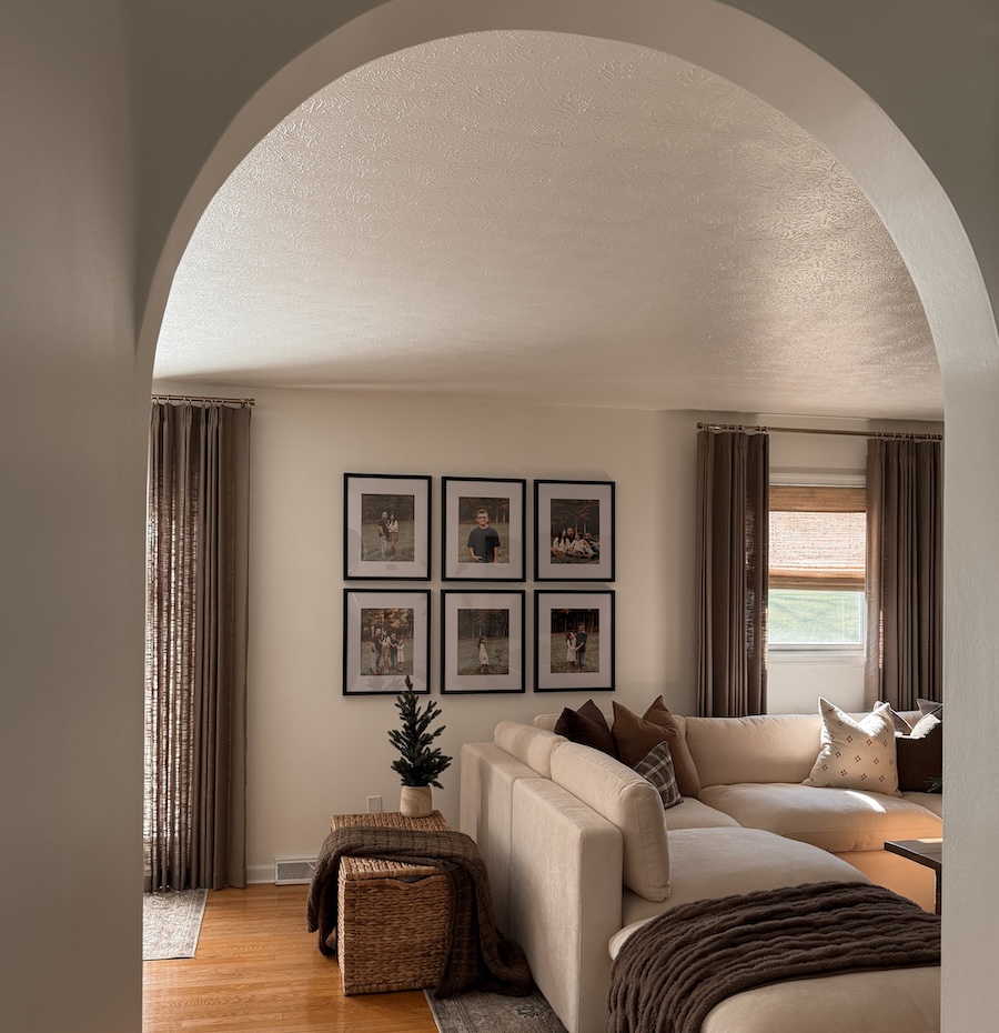
Grid: Identical frames in aligned rows and columns create the easiest layout for beginners. A 3×3 arrangement usually covers roughly 65–70% of a standard sofa width. The Classic Grid II, Classic Grid III, and Luxe Vertical Grid are great options for a ready-made 3×3 layout.
Horizontal row: All frames share a single center line at 57–60 inches from the floor, while varying widths create a sense of movement. This layout works well for narrow walls above a console. Aim for 60–70% of the furniture width below. Two option for this include the Classic Triptych ($297) and the Luxe Triptych ($657).
Vertical stack: Two or three frames stack in a single column, centered on the wall. This layout fits tighter spaces or works as a flanking element beside a window or doorway. Keep the stack’s visual center at 57–60 inches. The Classic Stack ($225) is a ready-made version with three frames, while the Classic Stack II ($198) comes with two frames.
Offset staircase: Frames step diagonally upward to follow a staircase line or create dynamic movement on a flat wall. Shift each frame about 4–6 inches horizontally and 6–8 inches vertically from the last. The Classic Staircase, priced at $308, delivers this look ready to hang.
Mixed-size cluster: Frames of different sizes group together so their outer edges form a loose rectangle. Target 60–75% of the wall width and keep interior spacing consistent at 2–3 inches. The Luxe Bricklay, designed by Bobby Berk, uses two frame sizes in a staggered brick pattern to create this effect.
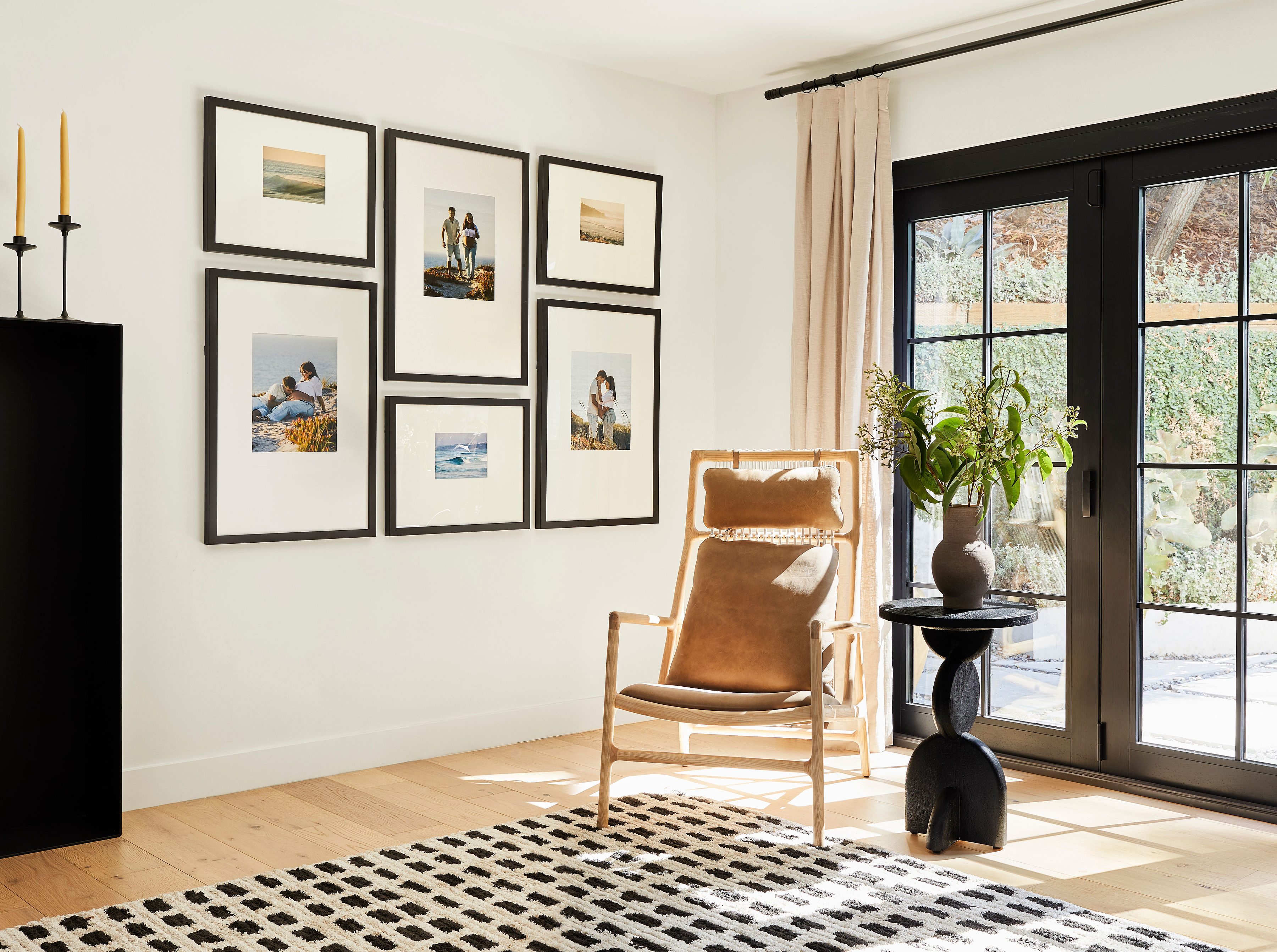
The 2–3 inch spacing rule and 57–60 inch center line
Two measurements shape almost every successful gallery wall, and getting them right turns a random cluster of frames into a single, intentional composition.
The ideal spacing between frames is 2–3 inches. Gaps under 2 inches feel cramped. Gaps over 3 inches make the arrangement read as disconnected pieces instead of a unified display. For frames 16×20 inches or larger, spacing can stretch to 3.5 inches. For frames smaller than 5×7 inches, tighten to 1.5–2 inches so they don’t disappear into the wall.
The 57–60 inch center line comes from the museum standard used worldwide. Austin Gallery recommends treating the entire frame cluster as one rectangle and placing its center at 57 inches from the floor, with 58 inches as a reliable default. Focus on the visual center of the whole group, not any single frame.
Furniture clearance follows a separate rule because the relationship between art and furniture changes with each furniture type. Leave 7–10 inches between the top of a sofa or console and the bottom edge of the lowest frame so the art feels connected to the furniture without crowding it. Above a fireplace mantel, where the visual anchor is the opening instead of the top edge, tighten that clearance to 3–5 inches and center the arrangement over the fireplace opening.
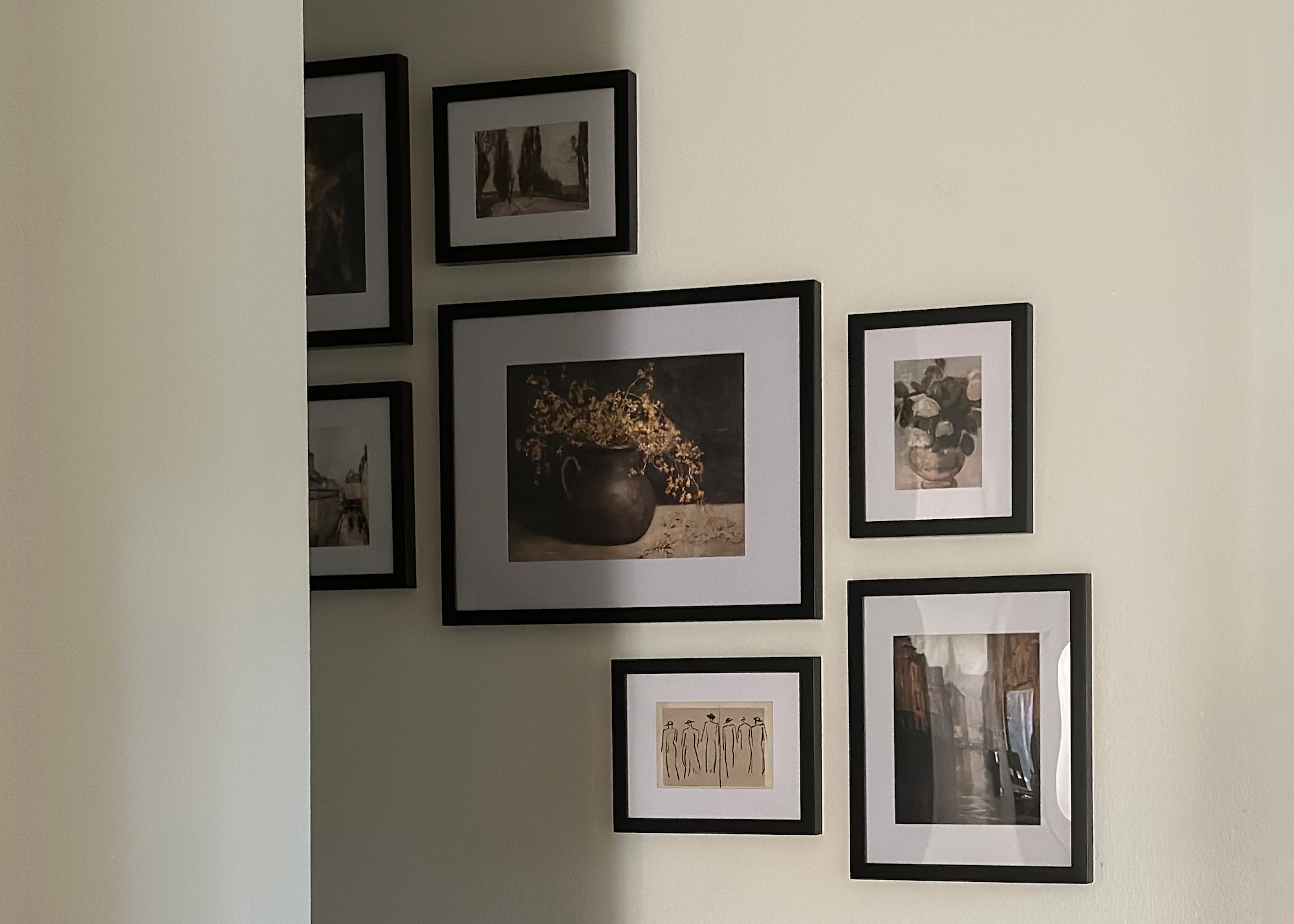
Common gallery wall mistakes and quick fixes
Most gallery wall issues fall into four buckets, and each one has a simple correction.
Over-spacing: Gaps of four or more inches make an arrangement feel like scattered individual pieces instead of a cohesive display. Fix: remeasure and close gaps to the 2–3 inch standard covered earlier.
Inconsistent gaps: Varying spacing from frame to frame quickly turns an intentional layout into something that looks accidental. Interior designer Gabriela Eisenhart recommends visually consistent spacing in both grid and organic layouts. Fix: use a ruler or spacer card cut to your target gap width and check every pair of frames.
Hanging too high: The most common gallery wall mistake is centering the arrangement above 60 inches from the floor, which makes the display feel disconnected from the room. Fix: measure to the visual center of the whole group and adjust down to 57–60 inches.
Wrong scale for the wall: Gabriela Eisenhart suggests filling 70–75% of the wall with the gallery arrangement. Too small and the frames float. Too large and they crowd the space. Fix: measure the wall and furniture width, calculate two-thirds to three-quarters of that span, and size the arrangement to match.
How gallery walls fit 2026 design trends
Gallery walls still feel current in 2026, but the overall aesthetic has shifted. The leading direction is midimalism, a design approach that blends minimalism and maximalism through intentional negative space, wider consistent margins of 3–5 inches in some layouts, and an invisible geometric anchor such as a central horizontal line or a squared outer boundary.
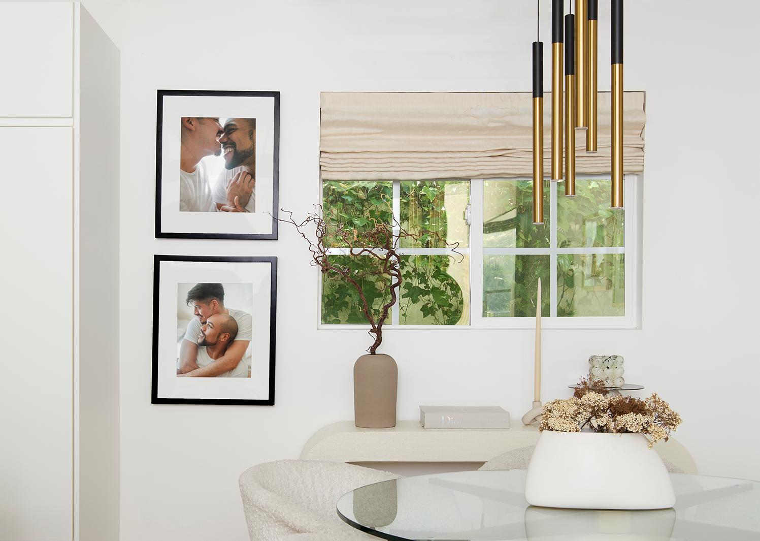
This approach creates a gallery wall that feels curated instead of cluttered. Current wall art trends for 2026 also favor calming neutrals like warm beige, soft gray, and grounding browns. Designers often pair those tones with texture-rich prints and natural frame materials such as raw oak, slim-profile walnut, and matte-finished metals. The takeaway: intentional and editorial styling is in, while random and overstuffed arrangements are out. A well-planned gallery wall that uses a gallery wall template fits this moment perfectly.
When a ready-made gallery wall beats DIY
DIY gallery walls feel rewarding when you have the time, patience, and confidence to measure, cut templates, and hang multiple frames precisely. If you’d rather skip the trial and error or want a guaranteed editorial result, Frameology’s ready-made gallery walls offer a smarter route.
Frameology offers two framed gallery wall tiers, and each one solves a different need. Classic gallery walls, starting at $198, use flexible Classic frames hung from a single center point per frame, which simplifies the hanging process. Every Classic gallery wall ships with a custom, life-size gallery wall template that removes all measuring and layout work. You tape the gallery wall template to the wall, hammer nails into the marked spots, remove the gallery wall template, and hang your frames. The whole process usually takes under an hour because the gallery wall template handles the spatial planning. Classic gallery walls don’t include hanging hardware, so you’ll supply your own nails.
Luxe gallery walls, starting at $638, use sealed Luxe frames hung from two points, left and right, for precise leveling and extra stability. Every Luxe gallery wall also includes a custom, life-size gallery wall template, plus all necessary hanging hardware: nails, plastic markers, and a mini-level. The installation sequence changes slightly from Classic because of the dual-point hanging system, yet the result looks professionally installed. CNN Underscored’s Stephanie Griffin described the Luxe Bricklay this way, “The Luxe Bricklay is called ‘luxe’ for a reason. Between the premium materials and foolproof hanging system that saved so much time and stress, it’s worth the hype.”
Frameology has earned over 7,500 verified 5-star reviews and a 4.98/5 overall rating and has been named “best for budget-conscious shoppers” by Hunker. Whether you choose Classic for strong value and fast shipping or Luxe for museum-quality materials and a complete hardware kit, both lines remove the guesswork that makes DIY gallery walls stressful.
Start framing your favorite memories at Frameology.
Frequently asked questions
What’s the correct spacing between frames on a gallery wall?
The standard recommendation from interior designers and galleries is 2–3 inches between every frame in a gallery wall arrangement. This range makes the frames read as one connected composition instead of a collection of individual pieces. The most important rule is consistency, because uneven gaps make an arrangement look unintentional, no matter how beautiful the individual frames are. Pick one gap measurement and apply it uniformly across every pair of frames in the layout.
How high should a gallery wall be hung in a living room?
The center of the entire gallery wall arrangement, not any individual frame, should sit at 57–60 inches from the floor, the museum standard calibrated to average standing eye level. When the gallery wall hangs above a sofa or console, leave 7–10 inches between the top of the furniture and the bottom edge of the lowest frame so the art stays visually connected to the furniture without crowding the space. In living rooms where people spend most of their time seated, some designers lower the center point slightly, closer to 55–57 inches, so the arrangement aligns with seated eye level.
Do all Frameology gallery walls include hanging templates?
Classic gallery walls and Luxe gallery walls include life-size gallery wall templates that make installation simple and straightforward. Canvas gallery walls and gallery walls created using Frameology’s Gallery Wall Design Service don’t include templates because their construction and customization work differently and often need more tailored installation approaches.
How wide should a gallery wall be relative to the sofa below it?
The two-thirds rule is the standard guideline: the total width of the gallery wall arrangement should span roughly two-thirds of the furniture below it, with some designers extending to three-quarters for bolder statements. The key is that the arrangement feels proportionally anchored to the furniture, wide enough to look intentional but with enough empty wall on either side so the composition can breathe. When you combine this rule with the 57–60 inch center line and 2–3 inch frame spacing, you have the three measurements that guide almost every successful living-room gallery wall.
