


Editorial gallery wall layouts: formulas that work
Written by: Daniel Koren, Co-Founder, Frameology
Key takeaways
An editorial gallery wall follows four structural rules: one aligned edge, consistent spacing, an intentional outer boundary, and one unifying element that makes mismatched frames feel deliberate.
The six layouts each use a clear formula and piece count, from symmetrical grids with 4–12 identical frames to loose salon walls with 8 or more mixed pieces and hero-plus-satellites arrangements with 4–7 total frames.
Alignment is the key mechanism: sharing one edge, top or bottom, across different-sized frames turns an irregular collection into a single, designed composition.
Consistent 2–3 inch spacing, a clean outer silhouette, and limiting frame styles to two or three finishes are the practical rules that create a professional-looking wall.
Frameology offers ready-to-hang Classic and Luxe gallery walls with a life-size gallery wall template that removes the guesswork from installation.
What makes a gallery wall read as editorial
Editorial gallery walls you save on Pinterest and Instagram stand out because of structure, not just the art. Kōōihaus design writer Laura Jones explains that a great gallery wall reads as one composition, not a collection of accidents. That effect comes from three properties: visual coherence, clear composition, and consistent spacing. The six named editorial gallery wall layouts and their formulas are:
Symmetrical grid: identical frames in a perfect square or rectangle, commonly 4, 6, 9, or 12 frames.
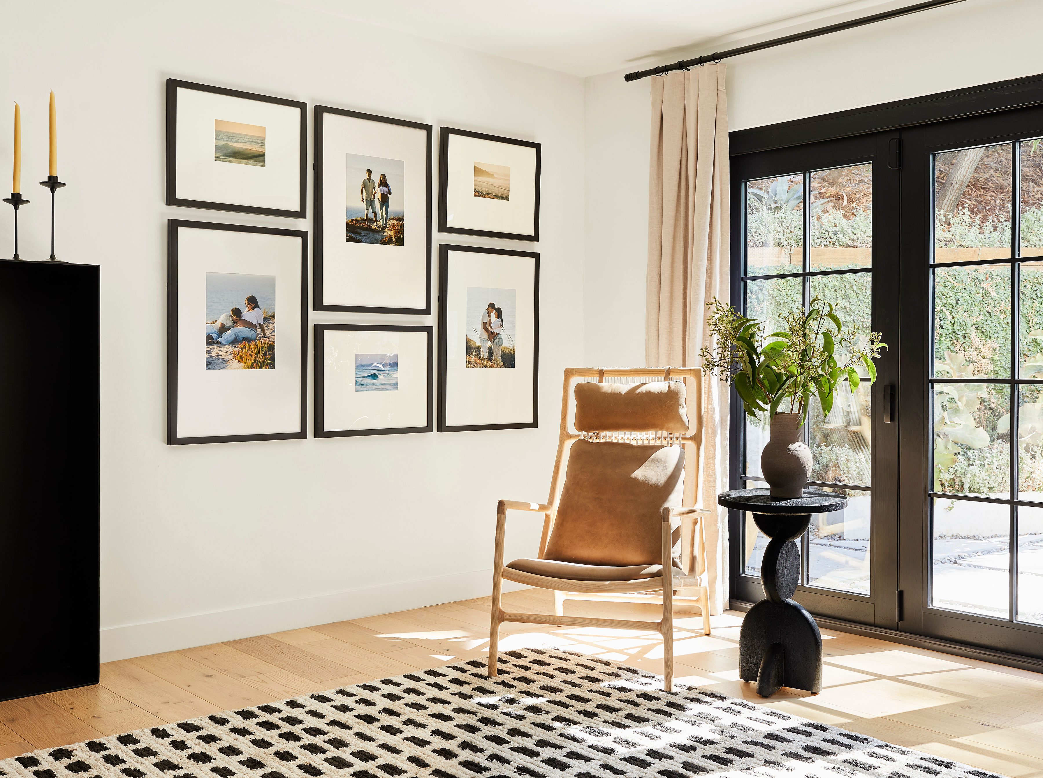
Loose grid: frames of different sizes arranged in a grid with one shared edge, top or bottom.
Loose salon: mixed sizes and orientations packed densely with consistent gaps, with 8 or more pieces.
Hero + satellites: one large anchor piece with 3–4 smaller frames clustered around it, for 4–7 pieces total.
Horizontal run: a single row of frames hung at eye level, usually with the center of the arrangement at 57–60 inches from the floor and 3–5 frames, though some guides allow 3–7 or 4–8 frames.
Salon column: a vertical stack of 2–4 frames for narrow spaces.
Shop gallery walls with templates
Prerequisites and context: who this is for and what ‘editorial’ means
This guide speaks to design-conscious homeowners and renters who want their walls to match the inspiration photos they save. It also helps anyone planning a specific wall above a sofa, in a hallway, on a staircase, or across a large blank rental wall. Here are a few terms used throughout:
Gallery wall: a curated cluster of frames arranged together on a single wall so the eye reads them as one composition.
Salon wall: the dense, eclectic, floor-to-ceiling style that traces its roots to 17th-century France and the Paris Salon, where artworks were packed tightly because exhibition space was limited.
Grid layout: frames arranged in even rows and columns with consistent spacing.
Aligned edge: the shared top or bottom line that runs across frames of different heights and makes the arrangement feel intentional.
Outside boundary: the clean outer silhouette of the entire arrangement, treated as one rectangle.
Unifying element: one shared thread, such as frame finish, mat color, subject matter, or a repeated size, that ties mismatched pieces together.
Spacing range: generally 2–3 inches between frames, tightening to 1.5–2 inches for very small frames and widening to 3–3.5 inches for large frames.
The current decor moment reflects what Etsy’s Trend Expert Dayna Isom Johnson calls “Everyday Exhibits” one of Etsy’s key home decor trends for 2026. Johnson describes a shift toward a collected-over-time look that mixes frame styles like vintage wood and aged metals. That shift makes the editorial gallery wall feel more approachable because the look depends on clear rules applied with intention.
Browse Classic and Luxe gallery walls
The named editorial gallery wall layouts, with formulas
Each layout below includes a one-line formula, a piece count, the best wall type, and the unifying element that holds it together. These layouts mirror how a designer would describe and use them.
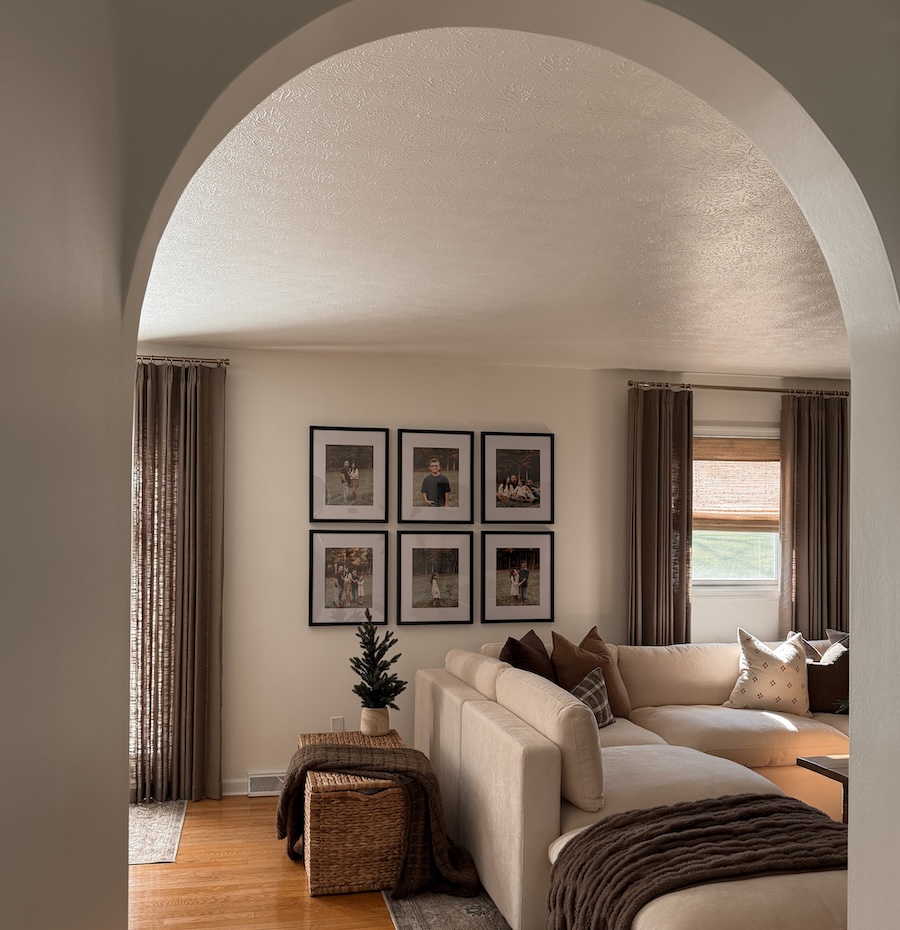
Symmetrical grid
Formula: identical frames in a perfect square or rectangle. Piece count: 4, 6, 9, or 12 frames. Best for modern minimalist spaces, above a console, or in a formal dining room. Unifying element: identical frames and acid-free 4-ply rag mats.
The symmetrical grid is the easiest layout to execute correctly because every frame is the same size and the spacing matches in both directions. Fine Art America’s gallery wall guide also rates it the easiest layout to get right. For a ready-to-hang version, Frameology’s Classic Grid gallery wall is priced at $594 and Classic Grid II gallery wall is priced at $675.
Loose grid
Formula: frames of different sizes arranged in a grid with one shared edge, top or bottom. Best for above a sofa or on a large wall. Unifying element: one aligned edge and consistent spacing.
The loose grid feels like the most editorial option because it mixes sizes while still looking organized. You see it in many of the gallery wall images you save, even if no one calls it by name. The shared edge creates that order. Frameology’s Classic Offset gallery wall is priced at $386 and Classic Offset II gallery wall is priced at $522, and both include a pre-designed arrangement and a life-size gallery wall template.
Loose salon
Formula: mixed sizes and orientations packed densely with consistent gaps. Piece count: at least 8 pieces. Best for stairways, tall walls, and large collections. Unifying element: consistent 1.5–2.5 inch gaps and a clean outer boundary.
Build-Construct’s gallery wall guide notes that a salon-style arrangement needs at least eight pieces to feel intentional, and that varying the gap by more than an inch anywhere causes the eye to pick up the drift. This layout demands the most planning and the most frames, yet it delivers the strongest collected-over-time look.
Hero + satellites
Formula: one large anchor piece with 3–4 smaller frames clustered around it. Piece count: 4–7 pieces total. Best when you already own one large piece. Unifying element: the anchor piece and consistent frame finish.
The Decorholic’s 2026 gallery wall layout guide recommends that the anchor piece account for 30–40% of the arrangement’s visual weight. Frameology’s Classic Triptych gallery wall is priced at $297 and Luxe Triptych gallery wall is priced at $657, and both echo this structure with the largest frame acting as the visual anchor.
Horizontal run
Formula: a single row of frames hung at eye level, usually with the center of the arrangement at 57–60 inches from the floor. Recommended frame counts often range from 3–5, with some guides allowing 3–7 or 4–8 frames. Best for hallways, above a bench, or on a long low wall. Unifying element: consistent center line and spacing.
The horizontal run distills the gallery wall layout rules into one line, one height, and consistent gaps. Gallery wall designers recommend aligning frames at their top or bottom edges in a single horizontal line to create a calm visual flow that makes a hallway feel longer. Frameology’s Classic Wide gallery wall is priced at $425 and Classic Wide II gallery wall is priced at $792, and both apply this layout at scale.
Salon column
Formula: a vertical stack of 2–4 frames. Best for narrow walls, between two doors, or either side of a bed. Unifying element: consistent width and vertical alignment.
The salon column applies the gallery wall layout rules vertically and suits spaces with limited width and generous height. Fine Art America’s guide identifies the column as the right layout for narrow walls and the strip between two doors. The Classic Stack II gallery wall priced at $198 is a great option for this layout.
Shop Classic and Luxe gallery walls
The alignment rule: how mismatched frames look intentional
The clearest structural rule many guides skip is the aligned edge. When you align one edge, top or bottom, across different-sized frames, the layout reads as deliberate instead of accidental. This rule drives both the loose grid and the loose salon layouts. Without a shared edge, mismatched frames look like separate objects. With one, they read as a single composition.
Art Hanging Helper’s gallery wall spacing guide states that when frames vary in size, designers should pick one strong alignment line, such as top edges, center lines, or an overall bounding box. Without that shared reference, a mixed gallery wall turns into a scattered collection instead of one coherent arrangement.
Choosing which edge to align depends on the wall and the furniture below it:
Align top edges when the upper boundary of the arrangement matters, such as under a clean architectural line or when you want the wall to read as a single horizontal band from across the room.
Align bottom edges when the lower boundary must relate to furniture or an architectural line below, such as above a sofa where the bottom edge of the lowest frames should feel connected to the sofa back.
Professional gallery-hanging guidance from Colorado Art Services confirms this approach. Align horizontal centerlines when works vary in height but should share a calm rhythm, align top edges when the upper boundary matters, and align bottom edges when the lower edge must relate to furniture, a dado, or a consistent architectural line.
The alignment rule applies across all six named layouts. In the symmetrical grid, every frame shares both top and bottom edges because all frames are identical. In the loose grid, one edge, usually the top, is shared across frames of different heights. In the loose salon, the alignment feels softer, yet the outer boundary still forms a clean rectangle that the eye reads as intentional.
Interior designer Nate Berkus summarizes the process in The Decorholic’s 2026 gallery wall layout guide: “The secret to a gallery wall layout that looks ‘effortless’ is that nothing about it is effortless. Every piece is auditioned. Every gap is measured. The spontaneity is staged.”
See gallery walls that use the alignment rule
The spacing and boundary rules
Consistent spacing creates the strongest visual difference between a professional gallery wall and an amateur one. Kōōihaus design writer Laura Jones calls it the defining factor: professional walls keep deliberate gaps, while amateur walls show gaps that jump around.
The spacing range that both AI tools and design guides surface is generally 2–3 inches between frames, tightening to 1.5–2 inches for very small frames and widening to 3–3.5 inches for large frames. Art Hanging Helper notes that consistency matters more than the exact number. If one gap looks noticeably larger than the others, the eye reads it as a mistake, even when frame sizes differ. The eye catches a gap half an inch wider than its neighbors quickly, so measuring beats eyeballing.
The outside-boundary rule matters just as much. An editorial wall keeps a clear outer edge. Art Hanging Helper recommends treating the outer edge of the arrangement as a clean silhouette so the gallery wall reads as one intentional composition. Plan that boundary before hanging anything. Tape out the full outer rectangle first, because that footprint determines whether the gallery feels centered over a sofa, dresser, or open wall section.
The unifying-element rule ties everything together. GalleryPlanner’s complete guide to gallery walls recommends limiting a gallery wall to two or three frame styles, such as black plus natural wood, to avoid visual chaos. One shared thread, like frame finish, mat color, subject matter, or a repeated size, helps mismatched pieces read as a curated collection.
Wall-specific editorial gallery wall layouts
Different wall types favor different layouts. These recommendations cover the four most common gallery wall locations.
Above a sofa
The loose grid or hero + satellites layout usually works best above a sofa. Mixtiles’ guide to hanging art above a sofa recommends sizing the arrangement to roughly two-thirds to three-quarters of the sofa’s width, with the bottom edge of the lowest frame sitting 6–10 inches above the sofa back. The center of the arrangement should sit at 57–60 inches from the floor.
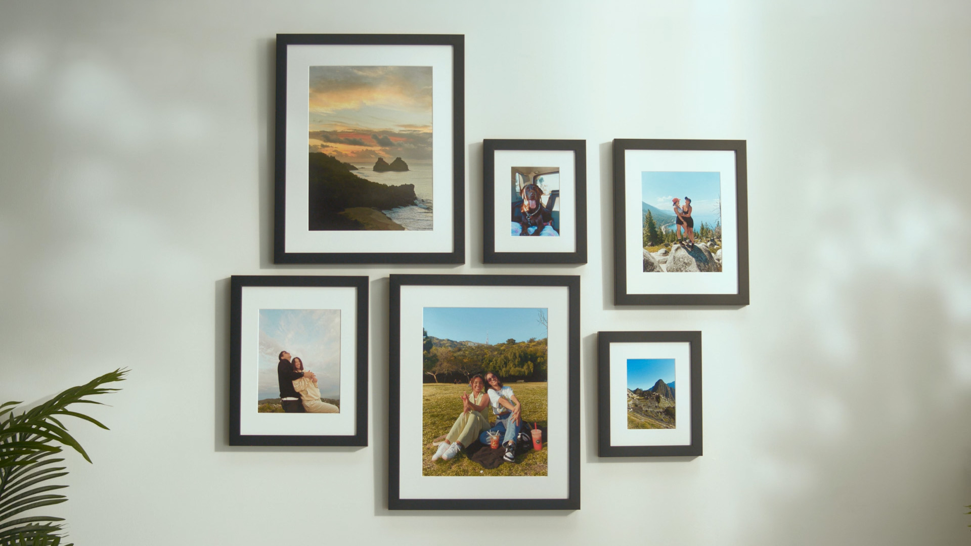
Bobby Berk described the Luxe Vertical Grid gallery wall, priced at $981, as “like an Instagram feed for your wall” and suggested it over a sofa, a console, or a large wall. For a more accessible option, the Classic Offset gallery wall, priced at $386, or the Classic Triptych gallery wall, priced at $297, both work well above a sofa.
In a hallway
The horizontal run or salon column layout usually suits a hallway best. Gallery wall designers recommend a single horizontal line of frames aligned at their top or bottom edges to create a calm, uninterrupted visual flow that makes the hallway feel longer. Keep the center of the arrangement at 57–60 inches from the floor.
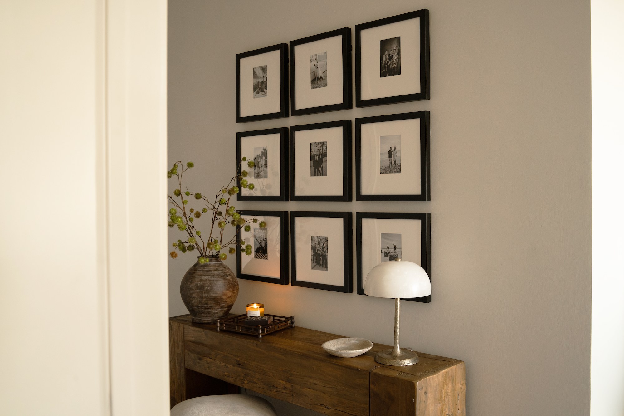
Frameology’s Classic Hallway gallery wall is priced at $466 and Luxe Hallway gallery wall is priced at $914. Both are designed specifically for this wall type and include a pre-designed layout and a life-size gallery wall template.
On a staircase wall
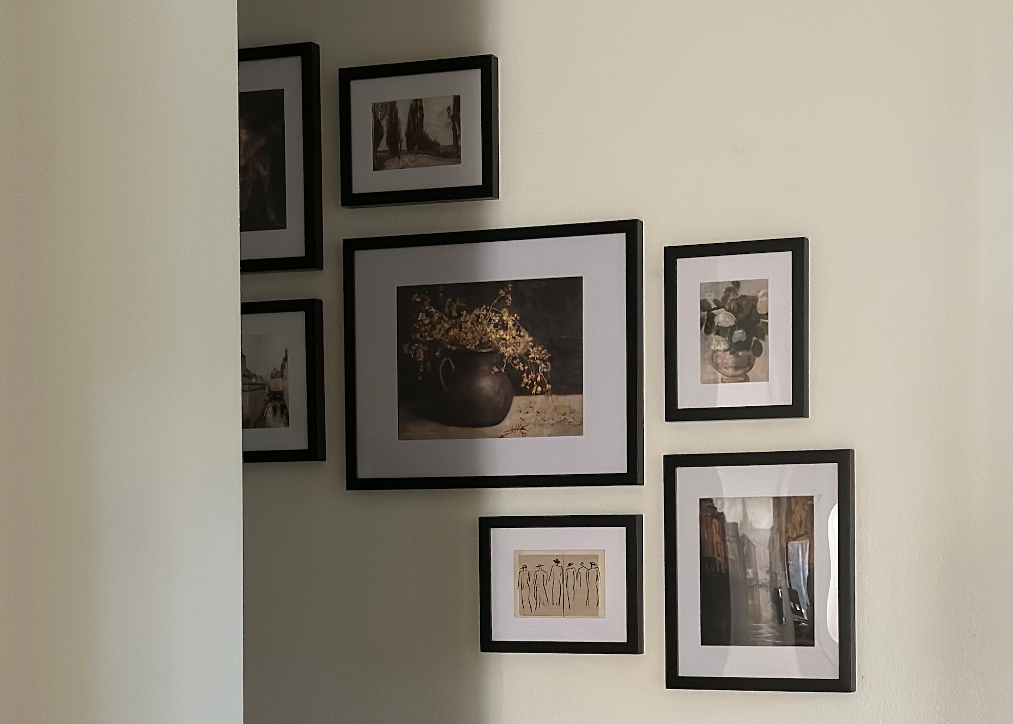
The loose salon or a staircase cascade layout works best on a staircase wall. Build-Construct’s gallery wall guide recommends measuring the rise and run of the stairs, marking a center line parallel to the stair angle, and hanging each frame so its bottom edge mirrors the slope of the treads while keeping vertical spacing consistent.
Bobby Berk calls the staircase layout “the perfect place to display family photos” and notes that his staircase collection “makes it so much easier to curate all your favorite memories into a layout that looks great,” in his Frameology feature. Frameology offers four staircase-specific options: Classic Staircase gallery wall, priced at $308, Classic Staircase II gallery wall, priced at $485, Classic Staircase III gallery wall, priced at $635, and Luxe Staircase gallery wall, priced at $953.
On a large blank wall
The loose salon or symmetrical grid layout usually works best on a large blank wall. Build-Construct’s guide recommends that a gallery wall fill about two-thirds of the available wall width to feel intentional. For a large wall, use a mix of sizes with one anchor piece that accounts for 30–40% of the arrangement’s visual weight.
Bobby Berk explains the inspiration behind the Luxe Bricklay gallery wall, priced at $1,074, as “a gallery wall layout that was versatile, simple, and symmetrical,” inspired by bricks laid in a stairstep pattern, in his interview. The Luxe Vertical Grid gallery wall, priced at $981, is another strong option for large walls.
Shop gallery walls for every wall type
How to test an editorial gallery wall layout before hanging
The paper-template method gives you a reliable way to test any layout before you pick up a hammer. Austin Gallery’s gallery wall spacing guide recommends cutting kraft paper to the exact size of each frame, marking the hook point on each template, and taping them to the wall with painter’s tape so you can adjust gaps before drilling any holes. Leave the templates up for a day and reassess from different distances and in different lighting.
Frameology’s Classic and Luxe gallery walls build on this idea. Every Classic and Luxe gallery wall includes a custom, life-size gallery wall template. You tape the template to the wall, hammer nails into the marked spots, remove the template, and hang the frames. A Classic gallery wall usually goes up in under an hour. Classic gallery walls don’t include hanging hardware, so you’ll need your own nails. Luxe gallery walls include all hanging hardware, nails, and a mini-level, so everything you need comes in the box.
House Beautiful contributor Janae McKenzie says, “I would absolutely recommend Frameology to anyone who knows they want a gallery wall, but doesn’t know how to make it happen.” CNN Underscored’s Stephanie Griffin also reports that the gallery wall looked professionally installed after using the Frameology system.
Frameology offers a mobile-only augmented reality (AR) preview tool that lets you see how a frame will look on your actual wall before you buy. The AR tool previews your frame or gallery wall and removes the guesswork of committing to a purchase without seeing it in your space first.
One caveat matters here: only Classic and Luxe gallery walls include life-size gallery wall templates. Canvas galleries and gallery walls created using Frameology’s Gallery Wall Design Service ($99+) don’t include templates because their construction and customization work differently and often need more tailored installation approaches.
Shop gallery walls with life-sized templates
Editorial gallery wall vs. family photo wall: when to break the rules
An editorial wall feels curated and rule-bound, while a family photo wall feels sentimental and flexible. Both approaches work, and the layout decision shifts based on which outcome you want.
For an editorial wall, the rules create the look. The alignment rule, the spacing rule, the boundary rule, and the unifying-element rule work together so the arrangement reads as one intentional composition. Breaking any of them casually often produces a wall that looks accidental.
For a family photo wall, emotional connection can matter more than strict alignment. Interior designer Lauren Conner advises mixing objects of different sizes and mediums in unexpected ways that reflect a family history, curated art, or a lifetime of travel. The rules can relax when the goal is personal resonance instead of editorial precision.
Frameology’s Classic line suits a flexible, swap-in-swap-out family display. Classic Wall frames start at $59 and feature a removable backing so you can swap photos whenever you want, which makes refreshing the display easy as new memories are made. Frameology’s Luxe line suits a permanent, museum-quality editorial statement. Luxe Wall frames start at $79 and feature a sealed kraft paper backing. Photos can’t be swapped, yet the result is a top-of-the-line, museum-quality frame hand framed in the United States that looks like it belongs in a gallery. Every Luxe frame includes all hanging hardware, nails, and a mini-level.
Common challenges and troubleshooting
Most gallery wall problems fall into a few predictable patterns, and you can catch them early with a quick check.
Frames that look crooked or accidental: Check that the aligned edge is level and that spacing matches on all sides. A frame can pass a bubble-level test and still look wrong if the gap on one side is visibly wider. Measure each gap instead of eyeballing.
Spacing that feels too tight or too wide: Austin Gallery identifies over-spacing as the most common gallery wall error. Frames that float four or five inches apart read as scattered individual pieces. Inconsistent gaps rank as the second most common mistake. Keep gaps in the recommended range and measure every gap for consistency.
A layout that doesn’t fit the wall’s proportions: Confirm that the arrangement spans about two-thirds of the furniture or wall width. Build-Construct’s guide notes that a gallery wall that hugs a single corner can look accidental. Tape out the full outer boundary first and confirm the footprint before hanging anything.
Fear of putting holes in a rental wall: Adhesive strips rated for the frame weight work on smooth painted surfaces. Build-Construct notes that they fail on textured walls and in humid rooms. For Classic frames, Command strips can work on smooth painted surfaces. Canvas prints stay lightweight and renter-friendly and can hang with damage-free mounting strips or velcro wall adhesives.
Measuring success
A successful gallery wall shows four clear signs: a clean aligned edge, even gaps within the recommended spacing range, an intentional outer boundary, and a wall that reads as one composition instead of separate frames. The first test is the view from across the room. The Decorholic’s guide advises viewing a gallery wall from at least 12 feet away because gallery walls read from a distance more than from three feet. If the outer boundary looks clean and the gaps feel consistent, the wall reads as intentional.
The longer-term test is how the wall feels months later. Gallerists Rob and Nicky Carter of London’s RNat5A gallery offer a simple benchmark: “You stop when it stops making you smile.”
Frequently asked questions
How many frames do I need for an editorial gallery wall?
Most editorial layouts use at least four frames, and salon-style walls often start at eight pieces. Focus on a clear layout formula and consistent spacing rather than chasing a specific number.
Can I mix black, white, and wood frames in one wall?
Yes, as long as you keep a unifying element. Limit yourself to two or three finishes, such as black and oak, and repeat them across the wall.
What height should I hang a gallery wall?
Most designers recommend placing the center of the arrangement at 57–60 inches from the floor. Adjust slightly for very tall ceilings or low furniture, but stay close to that range.
Do I need a gallery wall template?
You can hang a wall without a template, yet a gallery wall template speeds up planning and reduces mistakes. Every Classic and Luxe gallery wall from Frameology includes a life-size gallery wall template.
Which Frameology products work best for an editorial look?
For a polished editorial look, consider the Luxe Bricklay, Luxe Staircase, Classic Grid, or Classic Hallway gallery walls. Pair them with Luxe Wall or Classic Wall frames to extend the look across your space.
