


The best color schemes for modern home styling in 2026
Written by: Daniel Koren, Co-Founder, Frameology
Key takeaways
Modern 2026 color schemes favor warm neutrals, earthy greens, and rich browns over cool grays for a timeless, sophisticated look.
Each palette pairs specific paint colors with recommended frame finishes to create a cohesive, intentional room design.
The 60-30-10 rule helps balance dominant, secondary, and accent colors for a polished, professional result.
Natural wood, matte black, and brass frame finishes each complete the color story and elevate the overall space.
What are some good color schemes for modern homes?
The seven palettes in this guide reflect the main directions confirmed by leading interior designers for 2026 and use real, named paint colors from major brands. Here’s a quick-reference index:
Warm neutral & greige: the new classic
Earthy green & cream: the organic modern
Moody brown & stone: the grounded luxury
Muted blue & warm white: the refined coastal
Warm khaki & charcoal: the tailored neutral
Soft terracotta & cream: the sunbaked escape
Monochromatic green: the color drenched
The 7 best modern color schemes for 2026
Each palette below works as a ready-made recipe. You’ll see a walls-secondary-accent breakdown with real paint names, a best-for room callout, and a “finish it with” note on art and frame finishes so the color story carries through to your walls.
1. Warm neutral & greige: the new classic
Why it works: Cool, blue-based gray is giving way in 2026 to warmer neutrals like mushroom, greige, and warm taupe. This palette feels timeless and sophisticated and suits almost every room size and light condition.
Walls: Sherwin-Williams Universal Khaki (SW 6150), a warm, earthy, creamy tan, or Benjamin Moore Pashmina (AF-100), a mid-tone neutral.
Secondary: Mushroom, taupe, or a soft warm white like Benjamin Moore Swiss Coffee (OC-45).
Accent: Deep espresso brown such as Benjamin Moore Silhouette (AF-655), which can read as espresso, charcoal, or plum depending on lighting, or a muted sage green.
Best for: Living rooms, open-plan spaces, and hallways.
Finish it with: A natural wood or matte black frame. The wood echoes the greige warmth, while black adds a modern, graphic edge. Art with earthy tones or black-and-white photography works best.
2. Earthy green & cream: the organic modern
Why it works: Designers across the country see clients gravitating toward earthy greens from smoky olives to rich moss for their calming, restorative feel. This palette brings nature indoors without feeling rustic.
Walls: Valspar Warm Eucalyptus, a muted earthy gray-green, or Behr Hidden Gem (N430-6A), a smoky desaturated jade and Behr’s 2026 Color of the Year.
Secondary: Creamy off-white such as Pantone Cloud Dancer (11-4201), the brand’s 2026 Color of the Year, or a soft warm beige.
Accent: Terracotta, clay, or a deeper green like Benjamin Moore Narragansett Green (HC-157), a deep, dark blackened teal with gray and green undertones that can appear as a deeper mossy green in some lighting.
Best for: Bedrooms, home offices, and kitchens.
Finish it with: A light oak or brass frame. Light wood keeps the green airy, and brass adds warmth and a touch of luxury. Botanical prints or landscape photography feel especially at home.
3. Moody brown & stone: the grounded luxury
Why it works: Searches for chocolate brown and espresso have surged 153% year over year, and these tones now anchor many high-end interiors. This palette creates a rich, cocooning atmosphere that reads instantly luxurious.
Walls: Benjamin Moore Silhouette (AF-655), which can read as espresso, charcoal, or plum depending on lighting, or Warm Mahogany (PPG1060-7), a rich grounded red-brown and a 2026 Color of the Year pick from PPG/Glidden.
Secondary: Warm stone, travertine, or a soft warm gray.
Accent: Aged brass, copper, or a deep muted blue.
Best for: Dining rooms, powder rooms, and cozy dens.
Finish it with: A Luxe Vintage frame with a gold or brass finish. The metallic warmth echoes the accent metals and elevates the deep brown walls. Portrait photography or abstract art with warm undertones works beautifully.
4. Muted blue & warm white: the refined coastal
Why it works: Dusty, grayed blues are gaining traction as chameleon colors that shift with their surroundings. This palette feels coastal and relaxed while staying polished and grown up.
Walls: A dusty, grayed blue like Little Greene Salix, a cool, silvery gray with a hint of green, or Benjamin Moore Balboa Mist (OC-27), a pale gray with a slightly warm cast.
Secondary: Warm white trim and ceilings. Benjamin Moore White Dove (OC-17) is a reliable choice.
Accent: Natural rattan, warm wood tones, or a touch of ochre.
Best for: Bathrooms, bedrooms, and living rooms.
Finish it with: A white or light wood frame. White blends with the trim for a clean look, while light wood adds natural texture. Seascapes, abstract art, or black-and-white family photos all work well.
5. Warm khaki & charcoal: the tailored neutral
Why it works: Sherwin-Williams calls Universal Khaki “traditional values reimagined”. Pairing it with deep charcoal creates a high-contrast, tailored palette that feels modern and enduring.
Secondary: A deep warm charcoal or a rich walnut wood tone.
Accent: Matte black hardware, a pop of burnt orange, or a muted olive.
Best for: Home offices, living rooms, and entryways.
Finish it with: A matte black or dark walnut frame. Black creates a sharp, modern contrast against the khaki walls, while walnut adds traditional warmth. Graphic prints, architectural photography, or bold abstract art feel right at home.
6. Soft terracotta & cream: the sunbaked escape
Why it works: Terracotta and clay tones are gaining momentum in 2026. They pair naturally with organic materials and creamy whites to create warm, energetic, inviting spaces.
Walls: A soft muted terracotta or clay tone.
Secondary: Warm cream or a soft sandy beige.
Accent: Natural wood, woven textures, or a touch of deep olive green.
Best for: Kitchens, breakfast nooks, and sunrooms.
Finish it with: A natural wood or white frame. Wood complements the earthy tones, while white adds a crisp, clean contrast. Food photography, travel photos, or vibrant abstract art all suit this palette.
7. Monochromatic green: the color drenched
Why it works: Color drenching, where walls, trim, and ceiling share a single bold hue, is a standout 2026 trend. Green creates the most compelling version, with a serene and highly intentional feel.
Walls, trim, & ceiling: A single complex green like Dunn-Edwards Midnight Garden, the brand’s 2026 Color of the Year, or Benjamin Moore Ashwood Moss 1484, a deep graphite-green with strong gray undertones that can read as a near-black neutral.
Secondary: Variations of the same green in different finishes, such as matte walls with semi-gloss trim.
Accent: Natural textures like linen, wool, and wood for added depth.
Best for: Bedrooms, libraries, and cozy reading nooks.
Finish it with: A brass or gold frame. The metallic finish pops against the monochromatic green and adds a layer of luxury. Black-and-white photography or art with warm golden tones works especially well.
How to apply your palette: the 3-color, 60-30-10, and 3-5-7 rules
Once you’ve chosen a palette, the next step is deciding how much of each color to use. A few simple rules keep the room balanced and intentional.
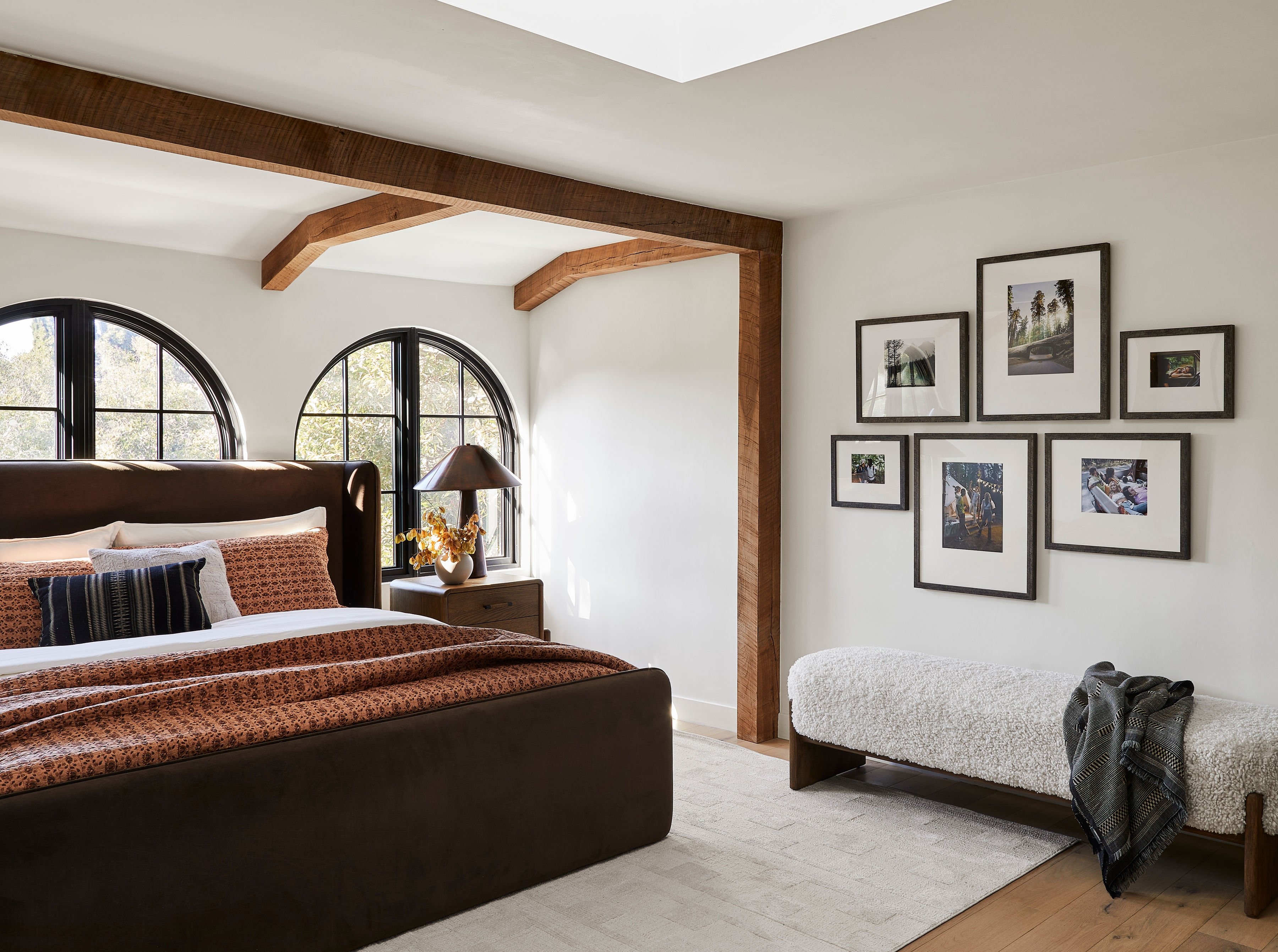
The 3-color rule says a well-designed room uses three distinct colors in unequal proportions. You’ll have a dominant base color, a secondary supporting color, and a smaller accent color. This structure keeps the space cohesive and avoids visual chaos.
The 60-30-10 rule turns that idea into numbers. Sixty percent goes to the dominant color on walls, large area rugs, and main upholstery. Thirty percent goes to the secondary color on curtains, accent chairs, and bedding. Ten percent goes to the accent color on throw pillows, art, lamps, and hardware. For 2026, Bigelow Designs suggests 60% warm creamy neutral, 30% mid-tone camel or walnut timber, and 10% deep chocolate brown or moss green anchor accents as a strong tonal structure.
The 60-30-10 rule works as a guideline. Designer Amanda Wyatt notes that there aren’t hard and fast rules in interior design, and the formula simply gives a confident starting point. A room split 55-35-10 can look just as good, as long as the color hierarchy stays clear.
The lesser-known 3-5-7 rule extends this thinking for larger spaces. Use three colors in a small room, five in a medium space, and seven across a whole-house palette. Benjamin Moore recommends building a whole-house palette with six or seven hues total, including a dominant color, a few secondary colors, a dedicated trim color, and one or two accent shades. These rules act as tools for confidence rather than strict constraints.
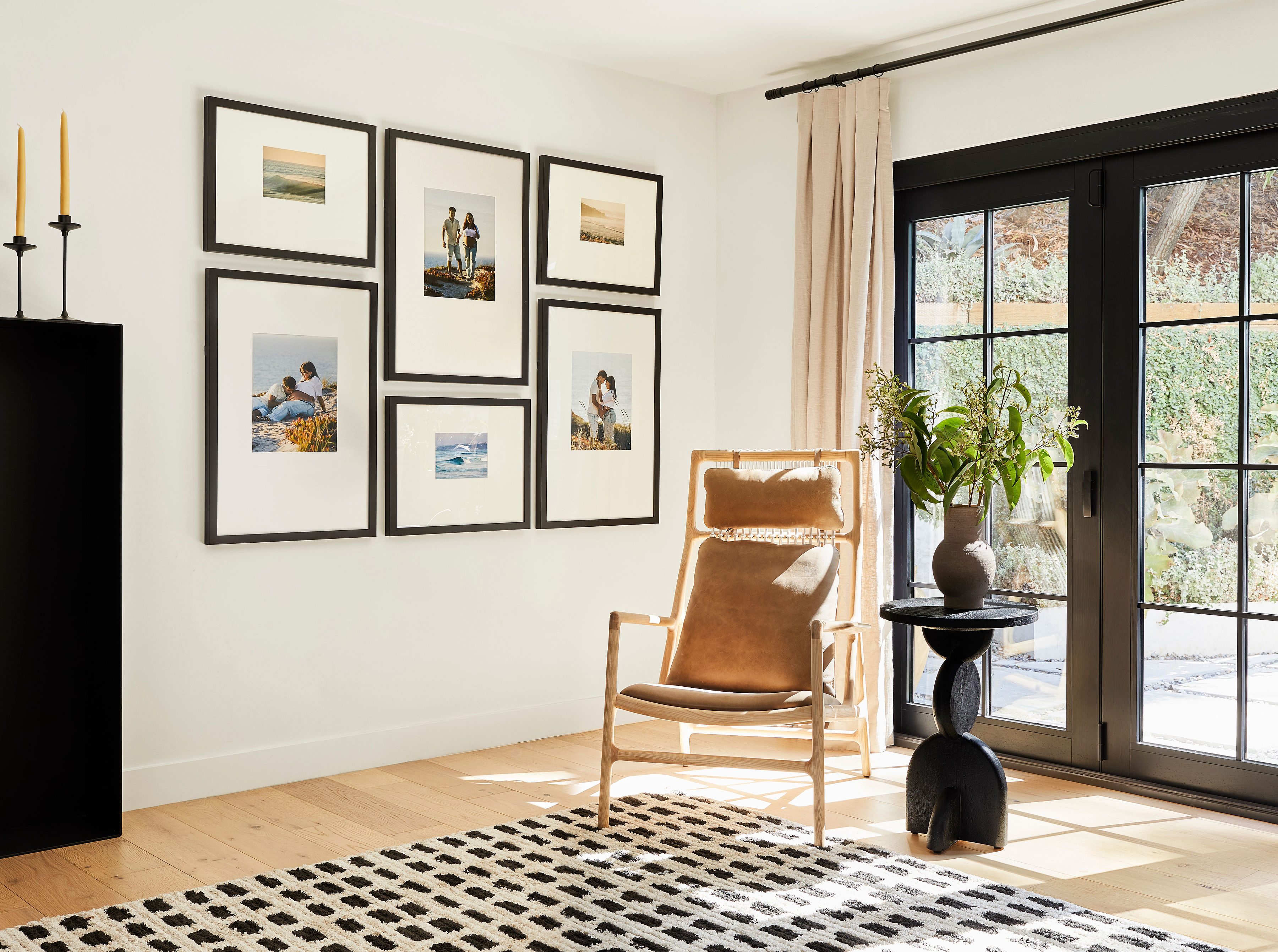
What color is replacing grey in 2026?
The cool, blue-based grays of the 2010s are giving way to warm neutrals like greige, mushroom, and taupe, along with earthy greens and rich browns. This shift shows up clearly in 2026 Color of the Year picks such as Sherwin-Williams’ Universal Khaki and Benjamin Moore’s Silhouette. Both point toward warmth, depth, and nature-inspired tones. Searches for warm neutrals like taupe, mushroom, and camel have grown 42% year over year, confirming the move away from the cool gray schemes that dominated the last decade.
What color makes a house look expensive?
High-end palettes share three qualities: depth, warmth, and restraint. Colors that mimic natural materials, such as charcoal for slate, deep navy for stone, and rich espresso for wood, tend to read as luxurious. Depth comes from these nature-inspired tones, while warmth and restraint come from using complex, “muddy” colors instead of bright primaries and pairing them with a matte or eggshell finish for a velvety look. Walls usually look best in eggshell or satin, with trim, doors, and moldings in semi-gloss. The contrast between matte walls and shiny trim is a hallmark of expensive design. Art and frames play a role too, since a frame finish that echoes the room’s metal accents or wood tones signals a deliberate, considered space.
What paint colors are outdated?
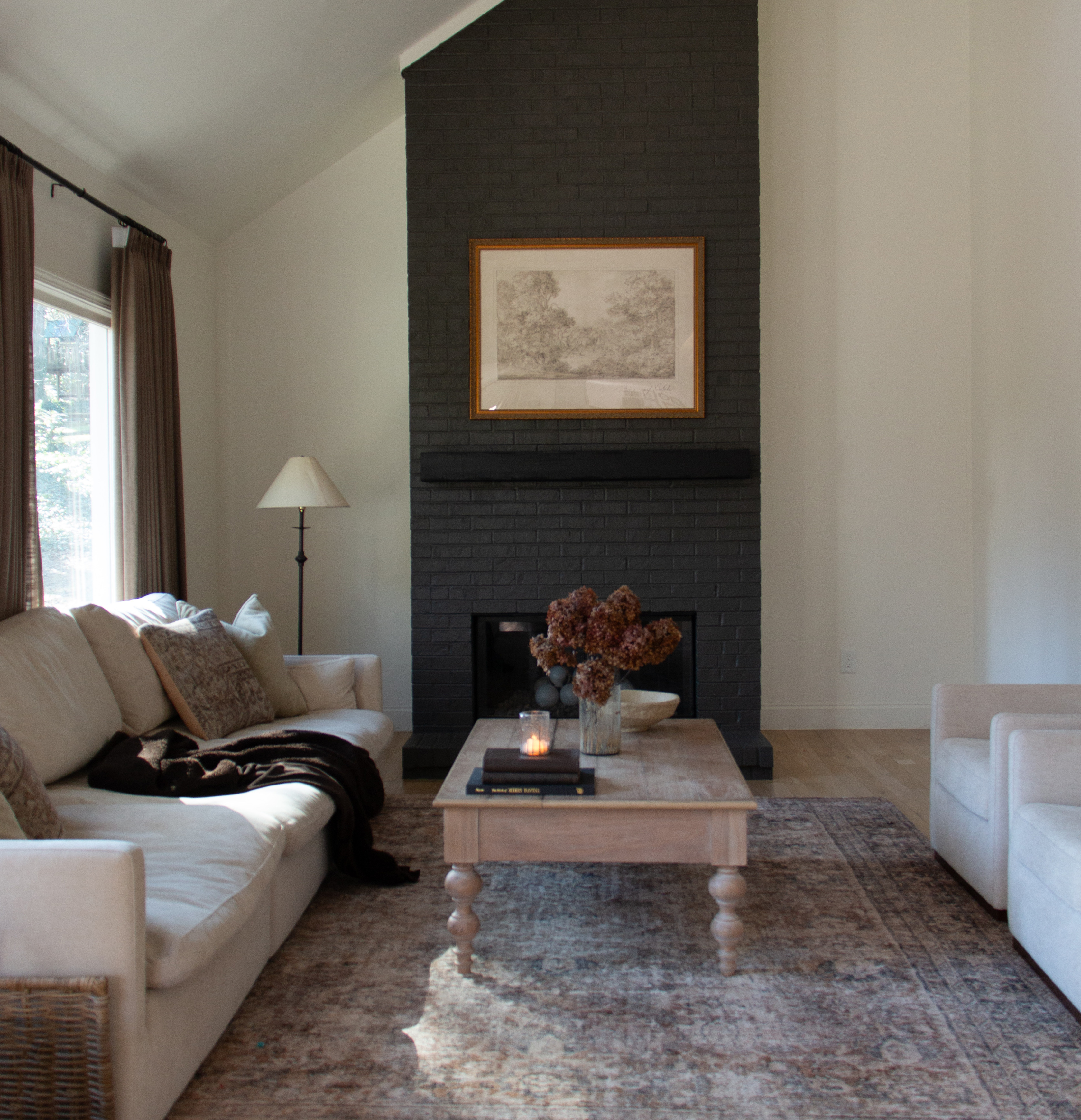
Monochromatic cool gray schemes feel the most dated in 2026 and often recall the “Agreeable Gray” look. Bigelow Designs recommends skipping monochromatic cool gray wall paint as a key move for current interiors. Stark, cool whites and flat, builder-grade beiges also read as tired. Current trends favor warmer, more complex neutrals that add depth and character. With that shift in mind, it helps to match each of the seven palettes to the rooms where they shine.
Room-by-room application: where to use each palette
Different rooms call for different moods, and each palette supports specific functions and feelings. Here’s where several of the seven palettes perform best.
Living room: The Warm Neutral & Greige palette is the most versatile and timeless choice for a main living space. Finish with a large-scale piece of art in a natural wood or black frame to anchor the room. A Classic or Luxe gallery wall works especially well here and carries the color story from the wall to the art.
Bedroom: The Earthy Green & Cream or Monochromatic Green palettes create a calming, restorative atmosphere. Use a brass or light wood frame for a touch of warmth that keeps the room restful.
Kitchen: The Soft Terracotta & Cream or Warm Khaki & Charcoal palettes add warmth and energy. A white or natural wood frame for art or a gallery wall keeps the space bright and clean while supporting the palette’s earthy warmth.
Dining room: The Moody Brown & Stone palette creates an intimate, elevated setting for entertaining. Pair deep brown walls with a Luxe Vintage gold frame and warm-toned art to echo candlelight and metallic accents.
Bathroom: The Muted Blue & Warm White palette feels spa-like and fresh. Choose white or light wood frames so the art supports the airy, coastal mood without overwhelming a smaller space.
With a palette assigned to each room, the final step is choosing art and frames that carry those colors onto the wall.
The Frameology completion step: where your color scheme comes together
A painted wall sets the backdrop, and framed art finishes the story. The frames you choose tie your palette together, and that’s where Frameology comes in.
Frameology brings 30+ years of family-owned framing heritage to a frictionless digital experience. That experience is backed by over 7,500 verified 5-star reviews and a near-perfect 4.98/5 star rating, and every frame is hand framed in the USA. The curated selection focuses on the strongest options and organizes them to prevent decision fatigue.
The two core framing tiers suit different needs. Classic frames, starting at $59 for wall frames, deliver strong value and fast shipping. They typically ship the next business day and arrive within a week. Classic frames feature a removable backing, so you can swap photos whenever you like.
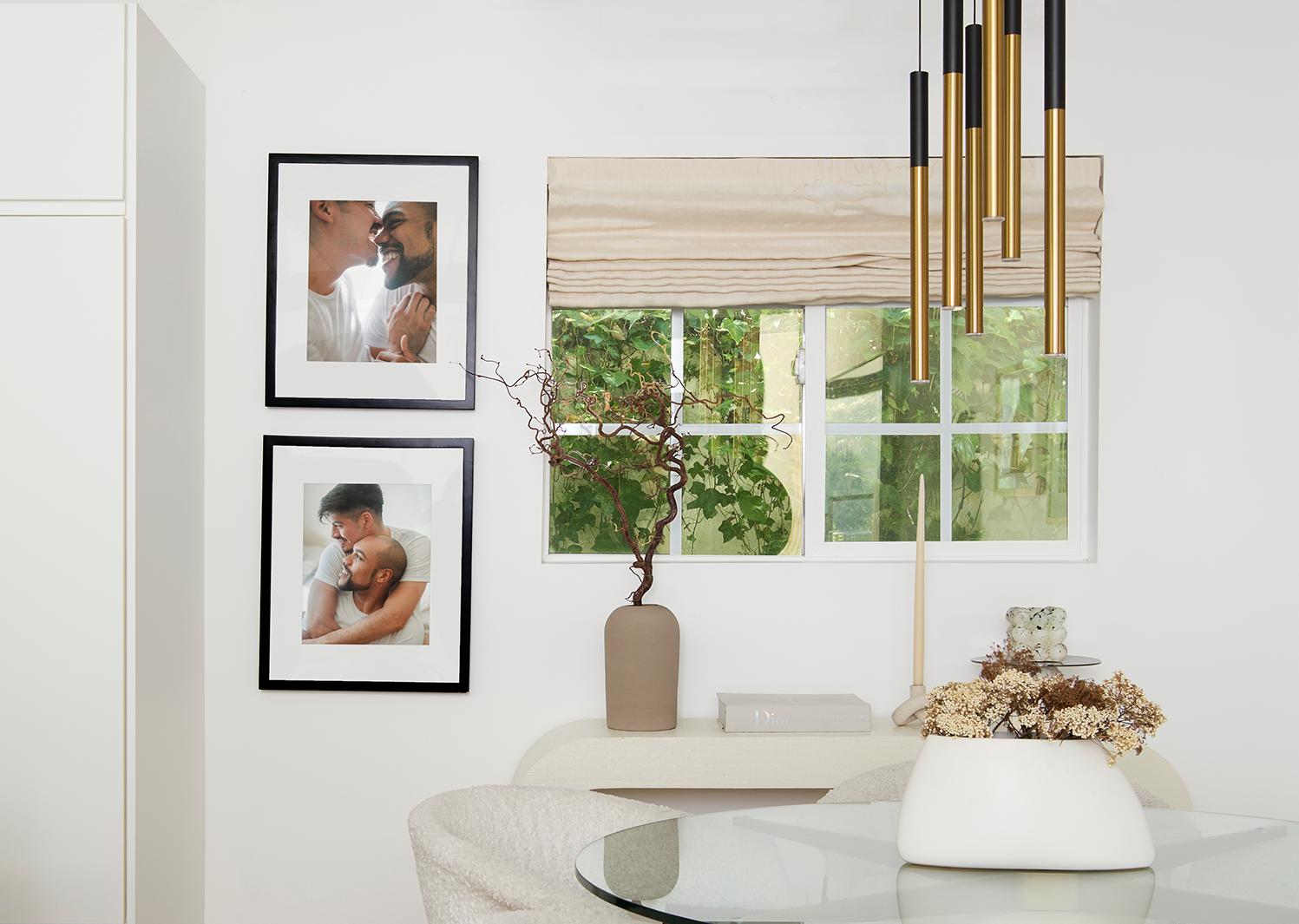
Luxe frames, starting at $79, are top-of-the-line and museum-quality. They’re USA-crafted with premium wood and metal moldings, acid-free mats, and UV-protecting museum-grade acrylic. A sealed backing protects your photo permanently. Luxe frames come with all hanging hardware included, such as nails, a mini-level, and a no-wire hanging system, and they take 7–10 business days due to their artisan craftsmanship.
For gallery walls, both Classic galleries, starting at $198, and Luxe galleries, starting at $638, include life-size gallery wall templates that make installation straightforward. Tape the template to the wall, mark the nail spots, and hang. Frameology’s mobile-only augmented reality (AR) tool lets you preview your exact frame on your wall using your phone, so you can see how the finish works with your palette before you buy.
Find the Frameology finish that completes your room.
Frequently asked questionsHow do I choose a color scheme for a small space?
In small rooms, warm neutrals with a Light Reflectance Value (LRV) between 65 and 75 usually work best. They reflect enough light to keep the space open while still adding depth and warmth. The 3-colour rule helps here: stick to three colors and let the dominant neutral carry most of the visual weight. Avoid LRV values below 45 unless the room has strong natural light. A single well-chosen piece of framed art in a light wood or white frame adds personality without making the room feel crowded.
Are warm neutrals safe for resale?
Warm neutrals are among the safest choices for resale. Greige, taupe, mushroom, and warm khaki appeal to a wide range of buyers, work with many furniture styles, and photograph well for listings. Highly saturated or polarizing colors on large surfaces can feel risky. Warm neutrals anchored by natural wood tones and earthy accents usually read as move-in ready and well maintained.
How many colors belong in one room?
The 3-colour rule and the 60-30-10 rule both point to three as the sweet spot for most rooms. One dominant color, one secondary color, and one accent color usually create a complete palette without chaos. Larger spaces can handle more variety, especially when you apply the 3-5-7 rule from earlier as a guide for whole-home planning.
How do I coordinate art with my wall color?
A reliable approach is to pull a secondary or accent color from the artwork and echo it in the frame finish or mat. Matching the frame exactly to the wall color tends to make the art disappear. Let the frame create a deliberate contrast or complement instead. For warm neutral walls, natural wood and matte black frames both work well. For deep, moody walls, brass or gold frames add warmth and pop. For muted blue or green walls, white or light wood frames keep the composition fresh and airy.
How do I test a paint color before committing?
Paint a test patch at least two feet by two feet on two different walls and live with it for three to five days. A small chip in store lighting doesn’t give a reliable preview. Move the sample around the room and check it under natural morning light, afternoon sun, and evening artificial light before making a final choice.
Do all gallery walls include hanging templates?
Classic and Luxe gallery walls include life-size gallery wall templates that make installation simple and straightforward. Canvas galleries, Metal galleries, and gallery walls created using Frameology’s Gallery Wall Design Service do not include templates because their construction and customization work differently and often require more tailored installation approaches.
Turn your favorite photos into framed art that matches your palette.
